Wellness · Immersive web · Studio management system
YogaRooted
A website made of paper, water and light, and the quiet system that runs the studio behind it.
- Client
- YogaRooted
- Sector
- Wellness · Classes, courses & consultations
- Market
- Spain · Online
- Role
- Art direction, design & full-stack build
- Timeline
- 2026
- Scope
- Immersive website · Booking · Courses · Invoicing · Reports
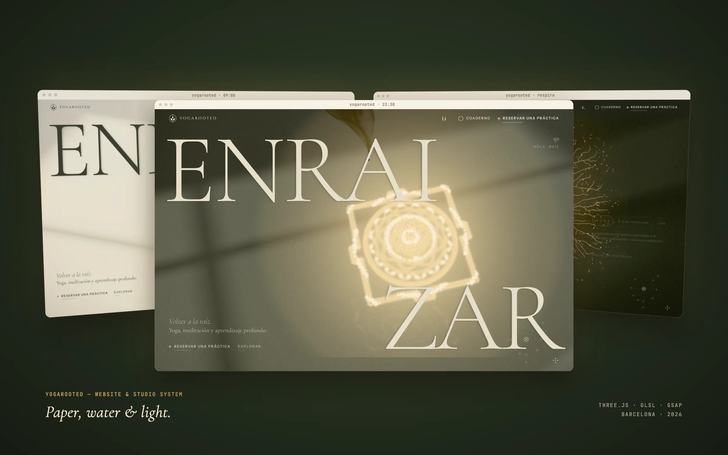
YogaRooted is a yoga and meditation studio run by one teacher. The brief asked for something that felt like crossing the threshold of a stone temple at dawn: epic, magical, full of aura, and calm. I art-directed and built that website in WebGL, and designed the management system that books, bills and reports behind it.
Wellness websites all look the same: sunsets, stock poses, a pastel booking widget. The studio needed the opposite: a place with real presence that still made the practical things (timetable, prices, booking) impossible to miss. And behind it, a teacher drowning in five tools and a paper calendar.
One material for everything: warm paper that can turn into water, receive light and hold gold. Every room is a small practice; every interaction has a calm fallback.
The logo, coming to life
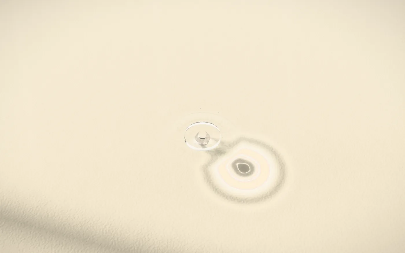
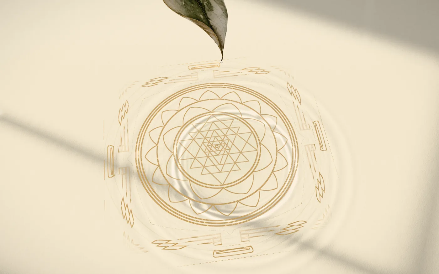
The studio’s mark is a drop, two leaves, an open circle and two points. The opening tells exactly that story in thirteen seconds: a branch in ink and watercolor, a drop that condenses and falls, paper that becomes water, ripples that draw a golden Sri Yantra, and finally the word Enraizar, to take root.
Nothing here is video. Each frame is rendered live with Three.js and custom GLSL: paper fiber, refraction, caustics, ink diffusion.
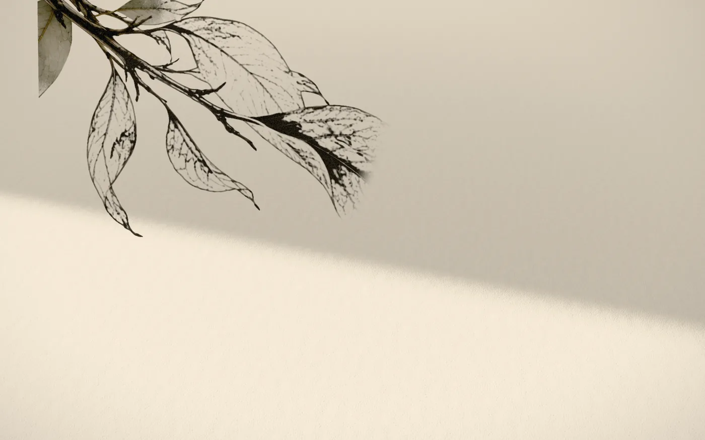

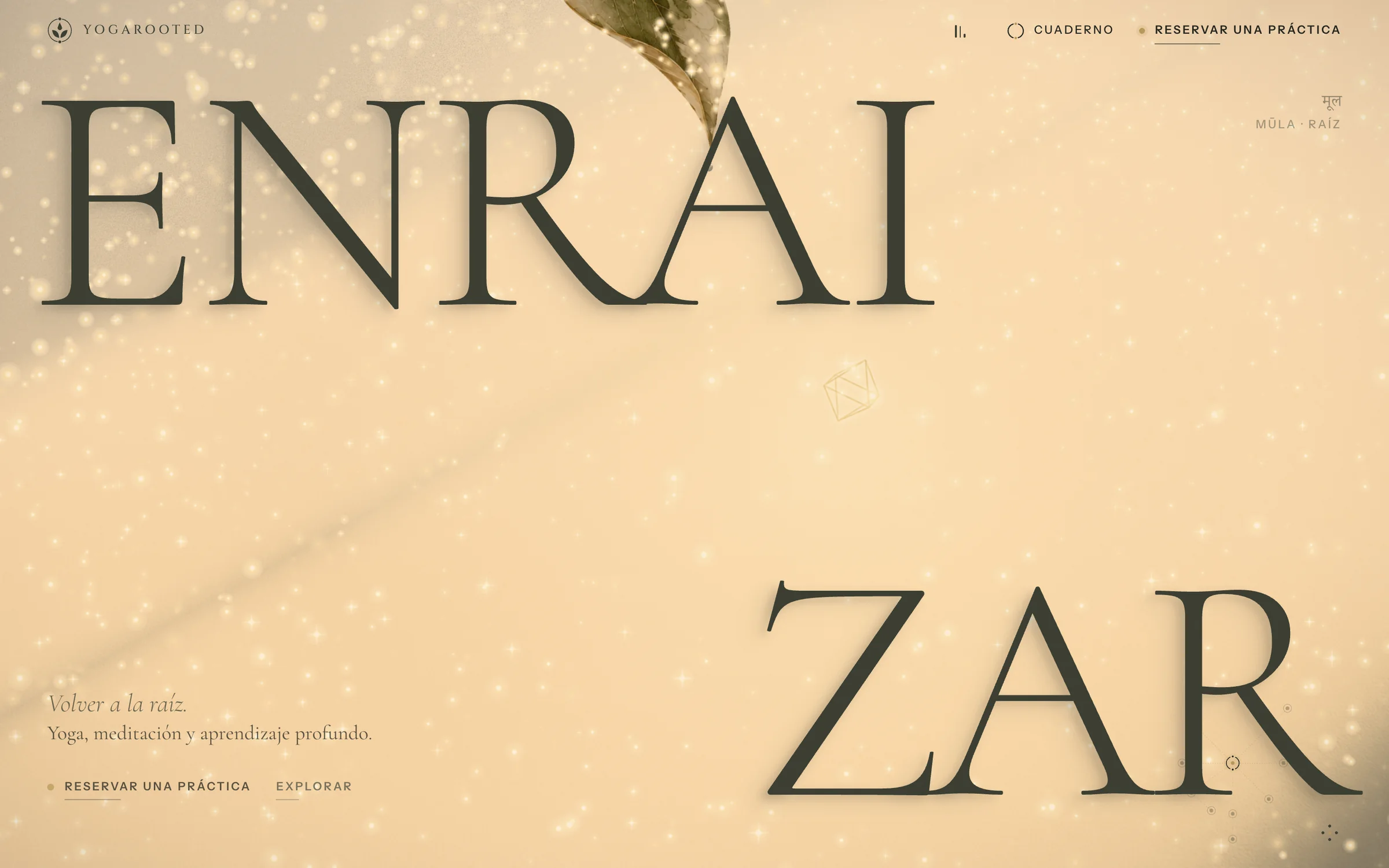
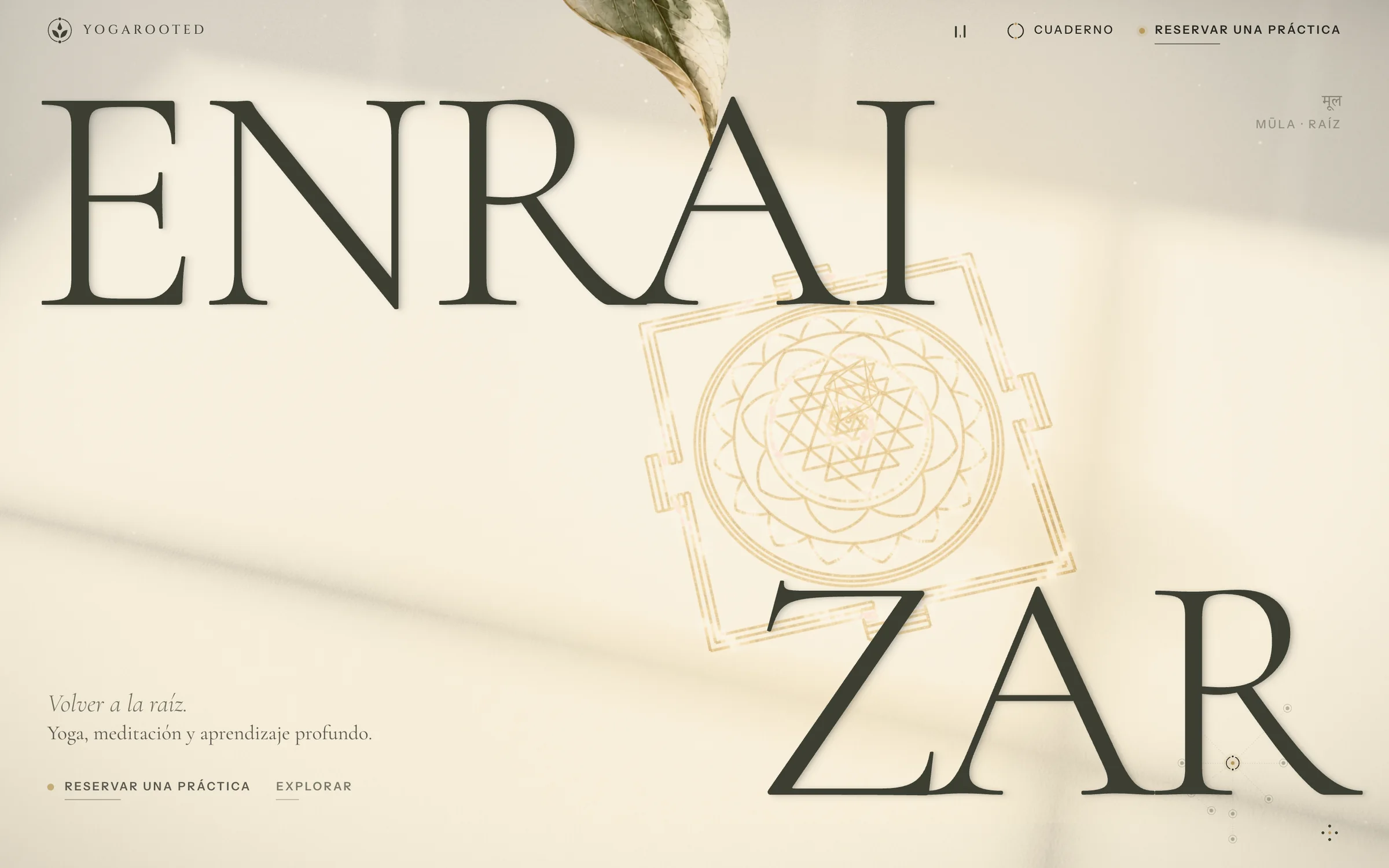
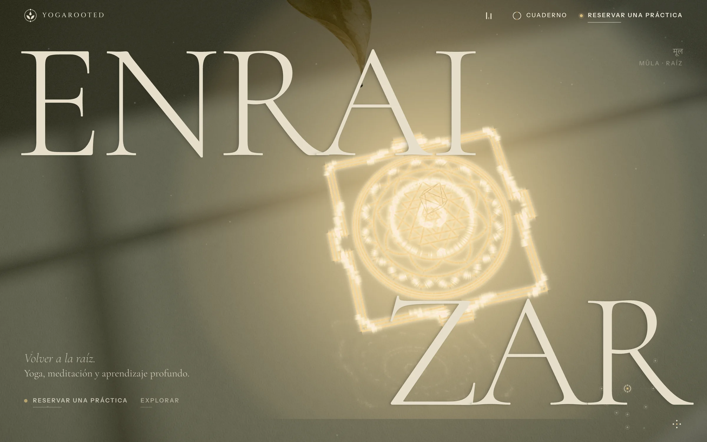
The same room at nine in the morning and at midnight
The site reads the visitor’s clock. At dawn the light is copper; at midday, clear; at dusk, gold. At night the paper turns to deep olive, the ink becomes cream and the yantra glows. Keyframes interpolate continuously, and contrast is measured to stay AA at every hour. Drag across the image:
A temple drawn line by line
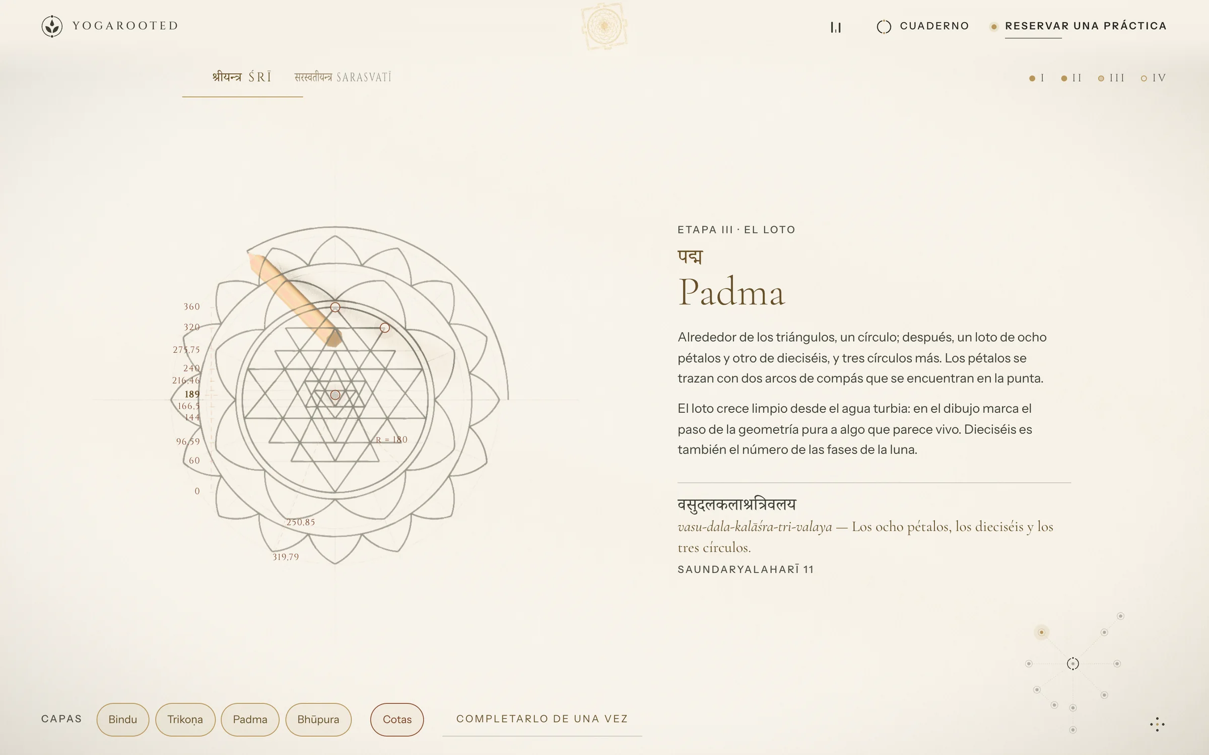
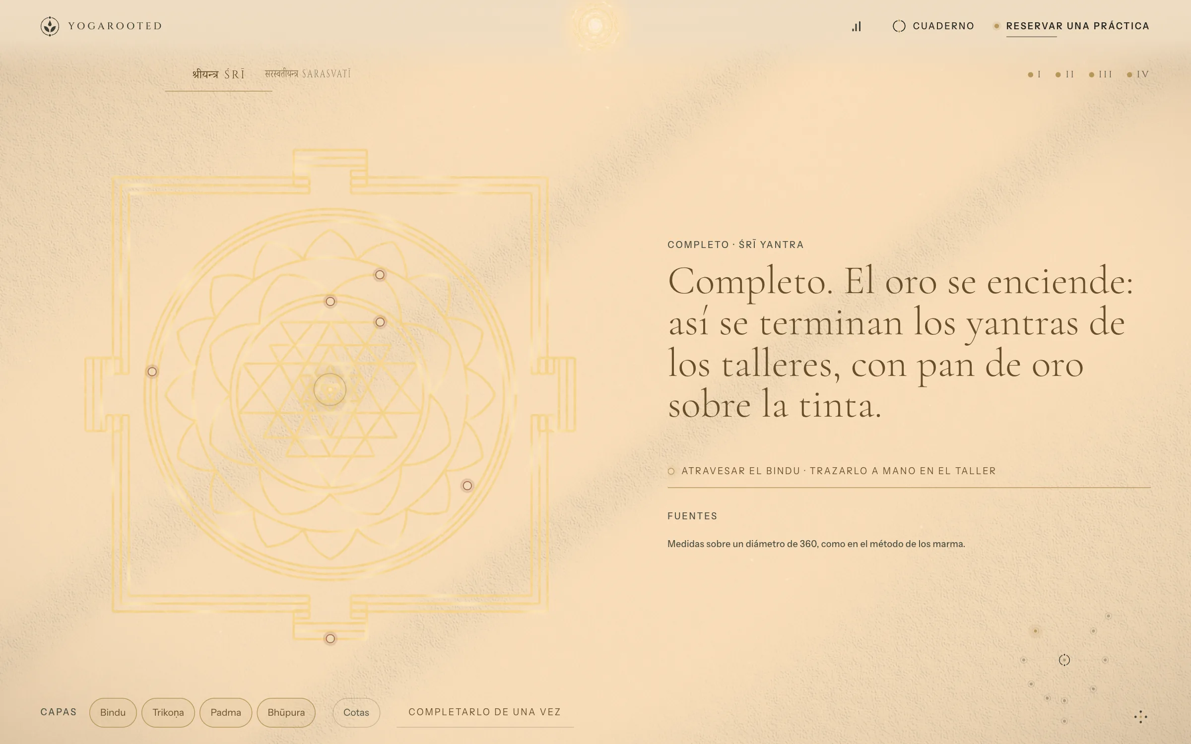
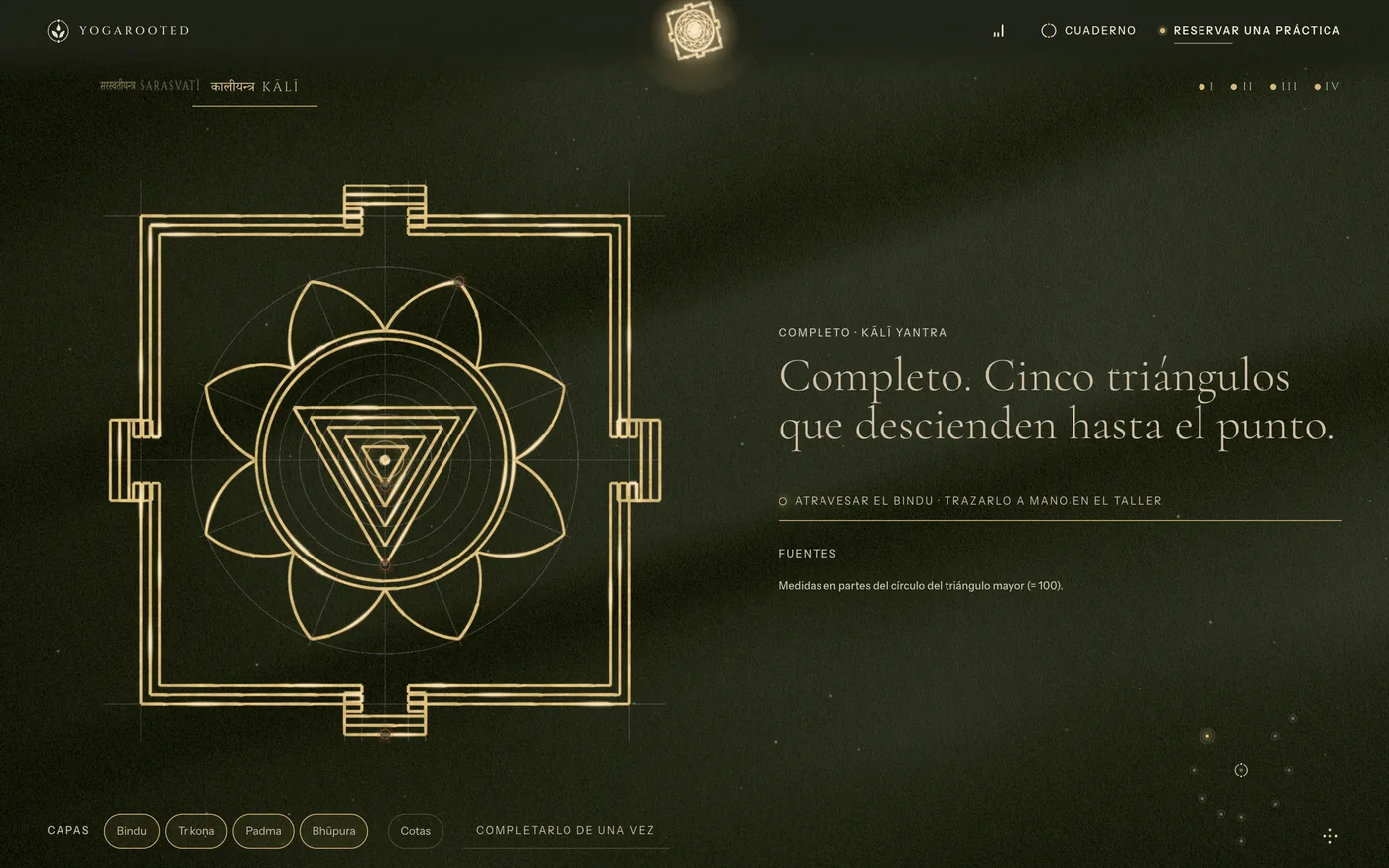
As you scroll, a Sri Yantra is constructed the way it is drawn by hand: pencil and compass first, dimension lines and construction points, then the lotus and the enclosure, and finally gold leaf over the ink. Every stage names its Sanskrit term, its transliteration and its source.
Rooms that reward attention
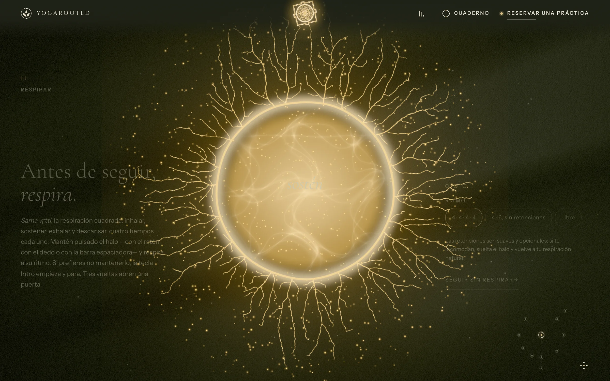
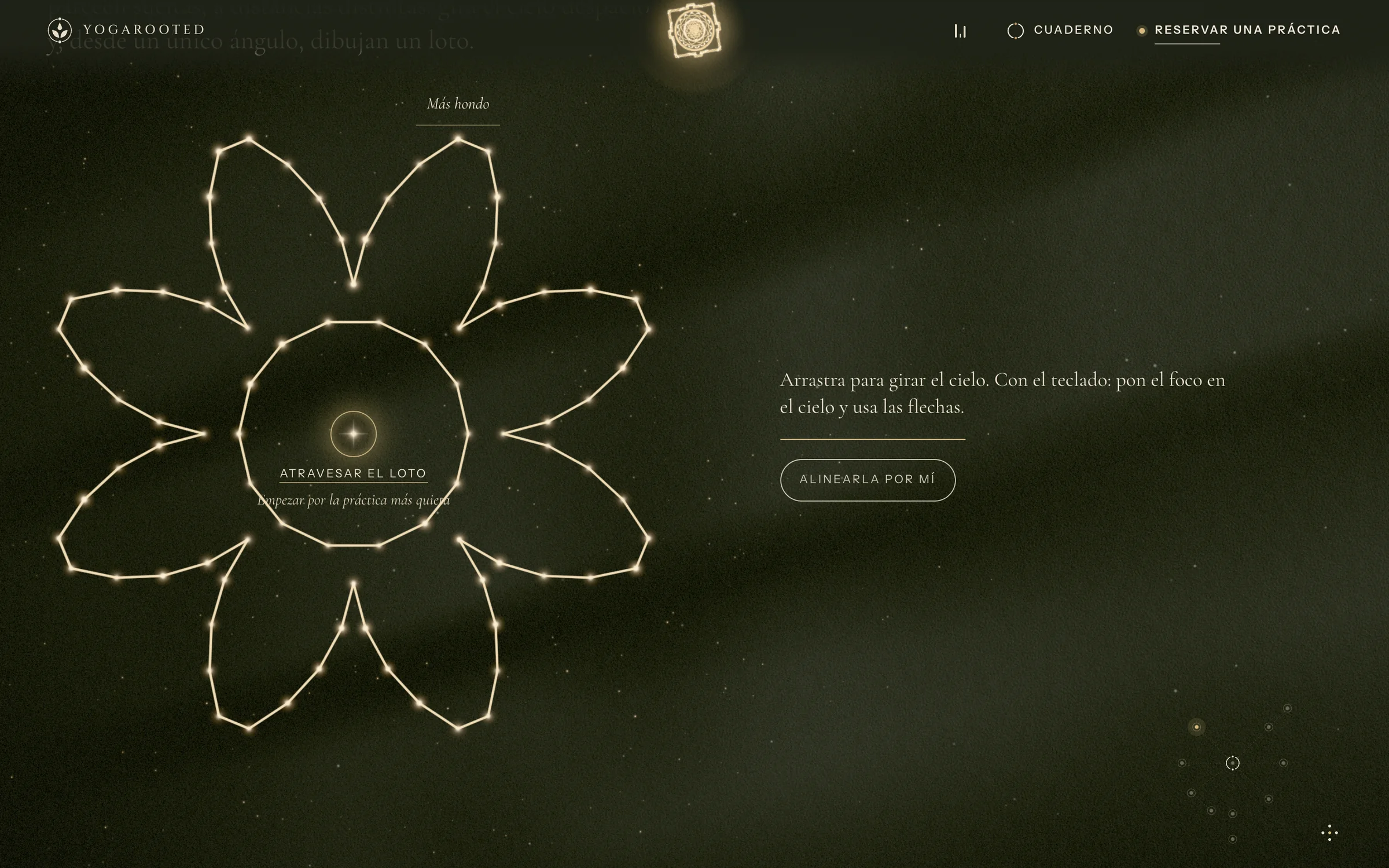
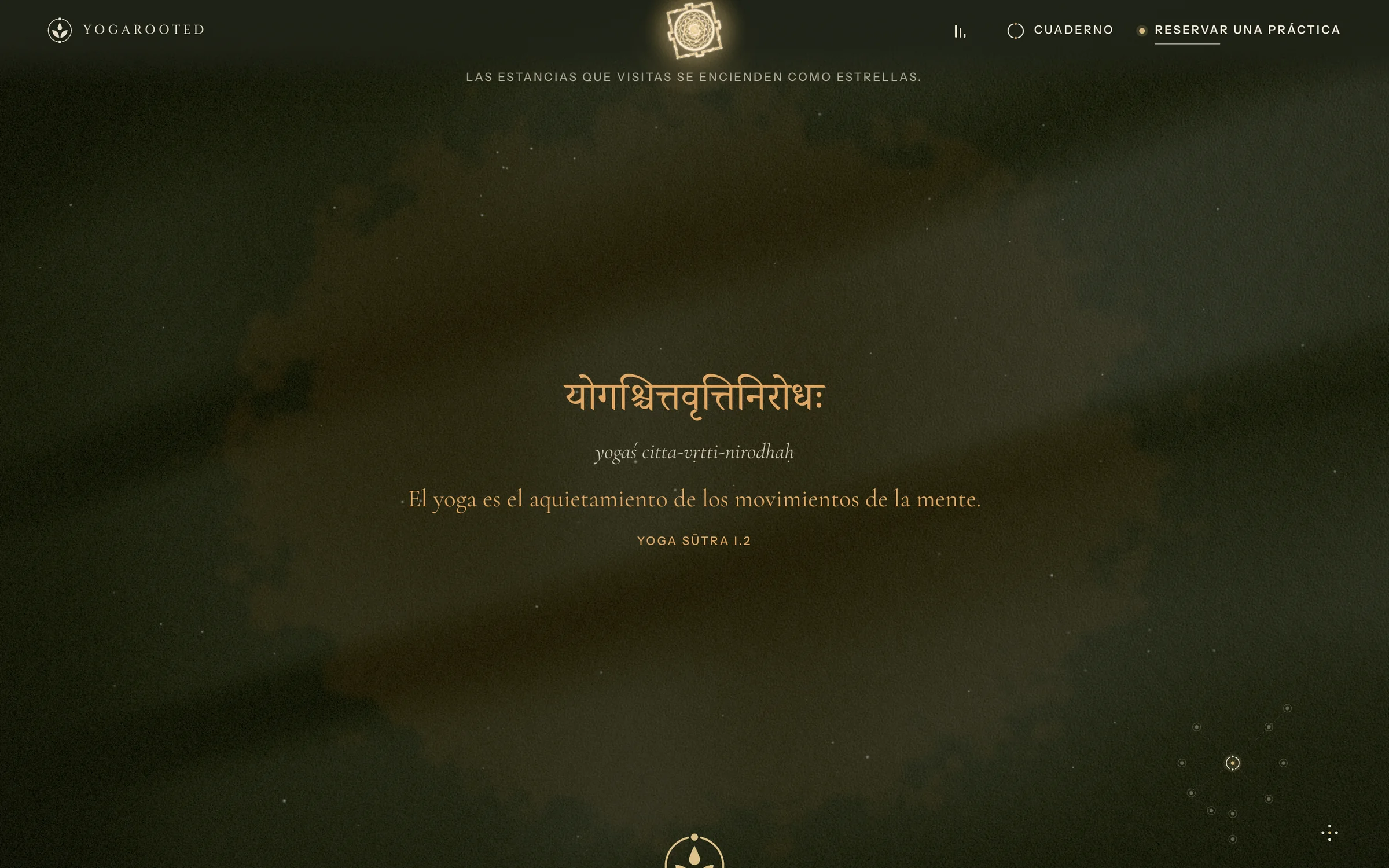
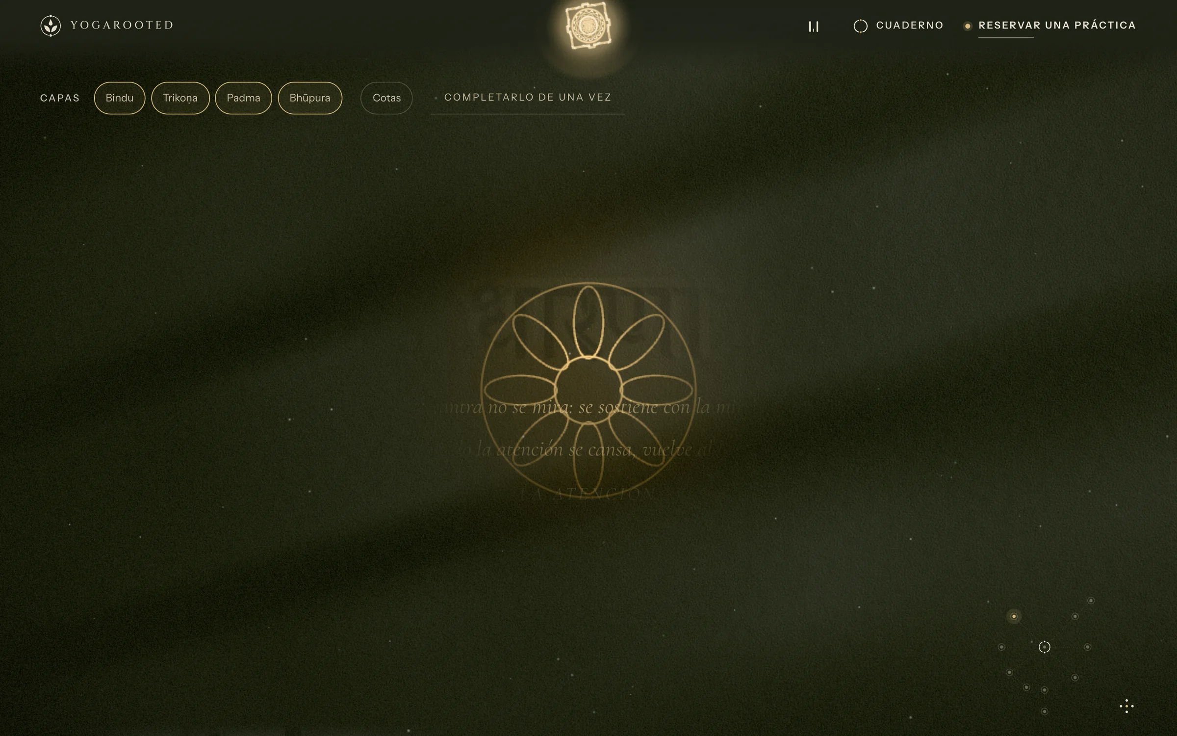
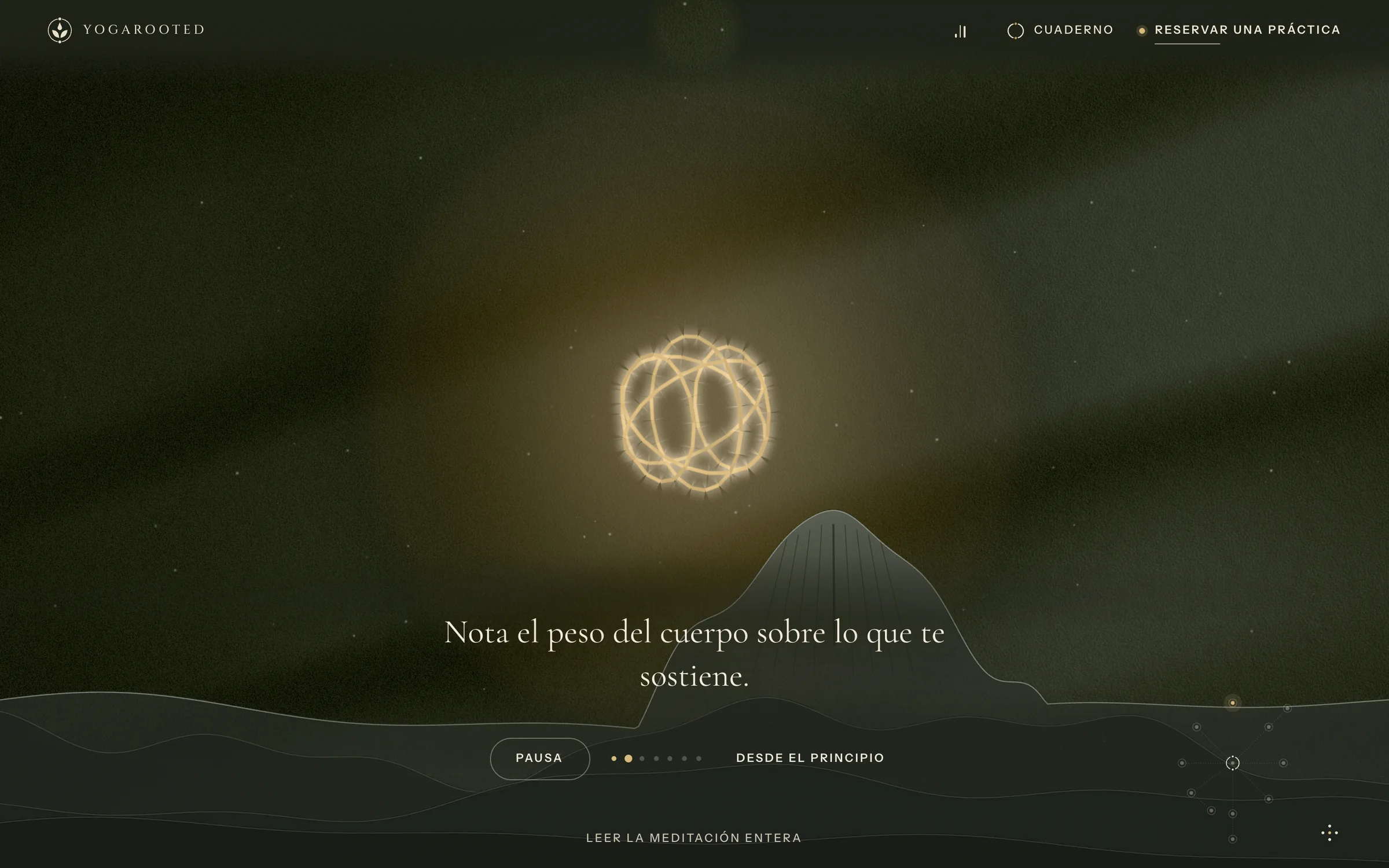
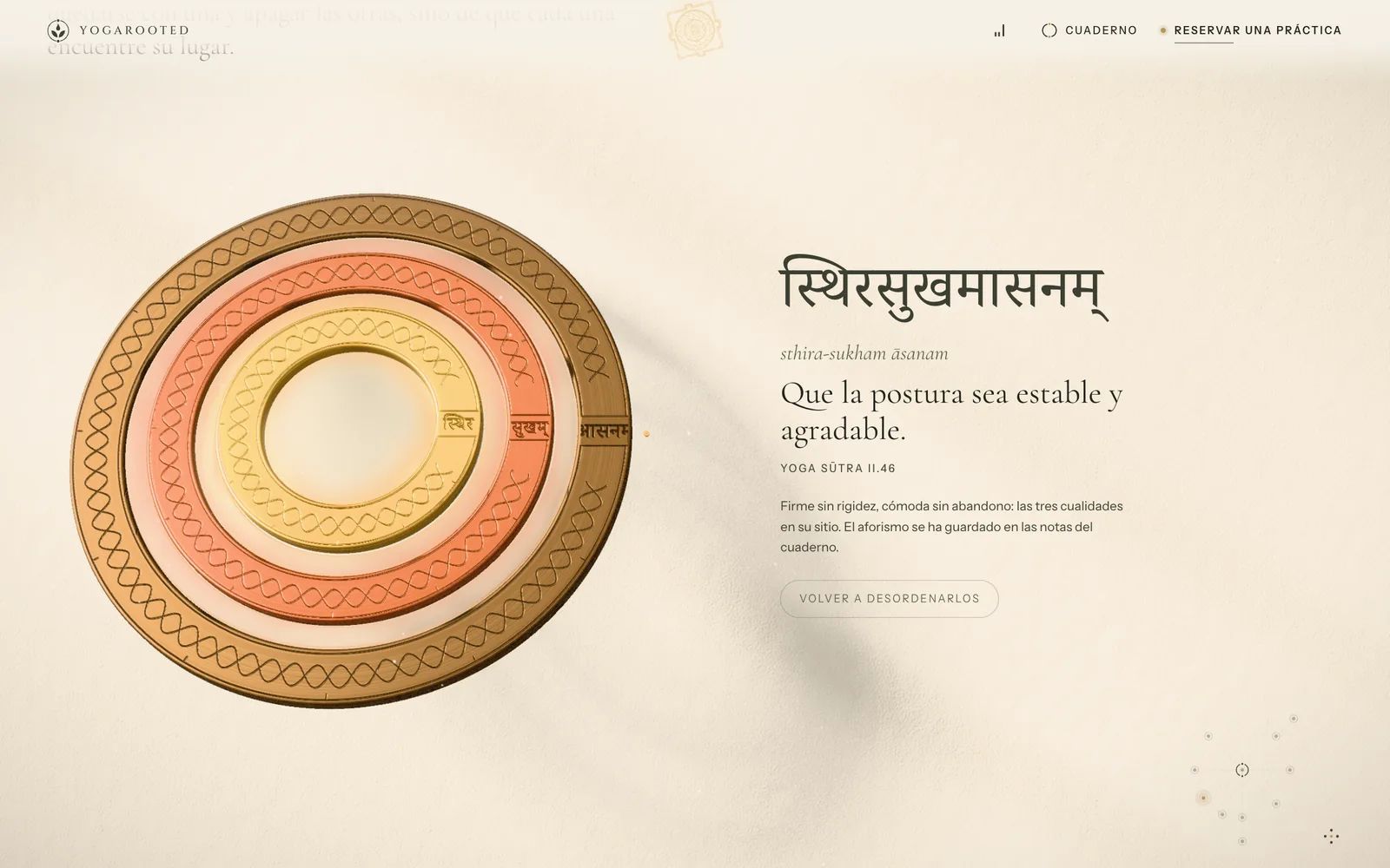
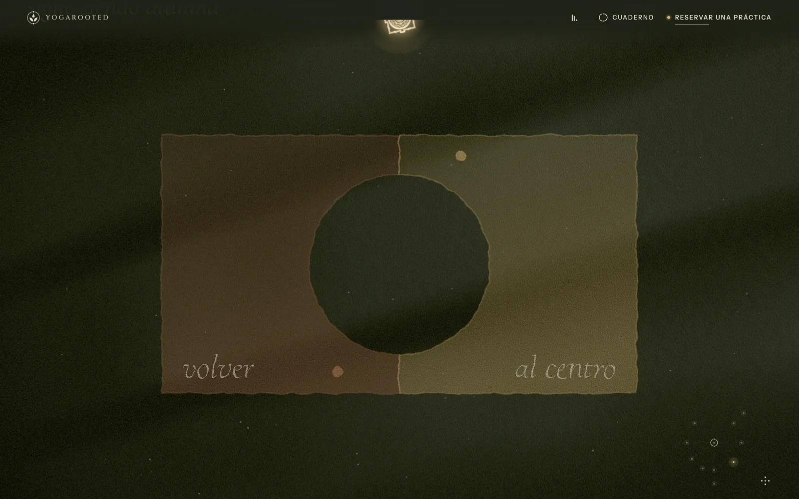
Hold the halo and it teaches square breathing. Shine a lantern and hidden notes appear. Stay still for four seconds and invisible ink rises: a Yoga Sutra in Devanagari. Turn the night sky until its stars become a lotus. And if you press three nodes of the Sarasvatī yantra in the right order, the paper fractures and lets you into a guided meditation.
- 2D version for low-power devices and browsers without WebGL
- A complete composition for reduced motion
- Adaptive frame rate: 60 fps on interaction, 10 fps at rest
- Every interaction reachable from the keyboard
Booking in three steps
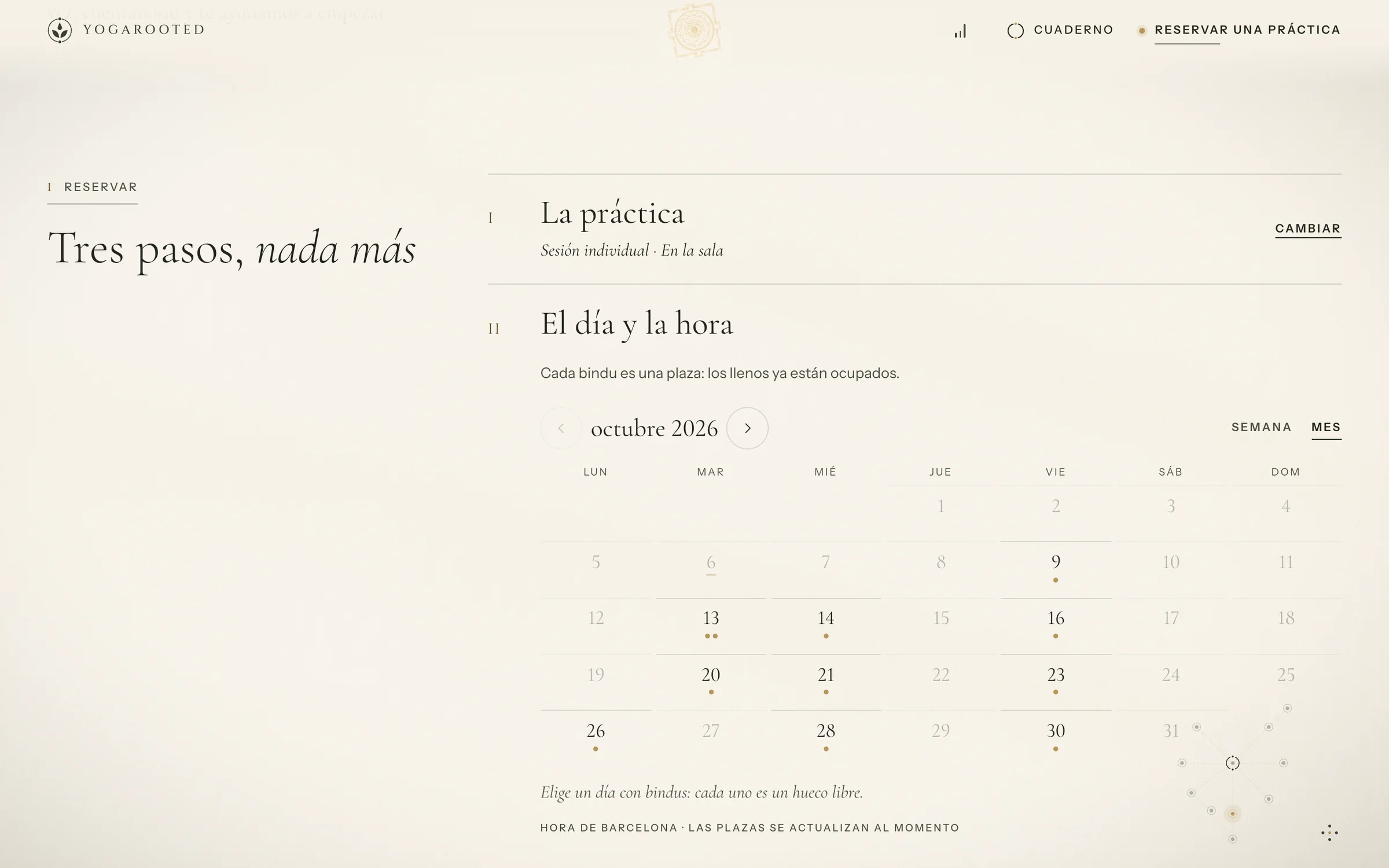
Practice → day and time → details. Each seat is drawn as a bindu (the point at the center of a yantra), so “two left” is information, not pressure. Online and in-person sessions share one calendar; courses, passes and consultations check out through the same flow, and invoices are generated from the order.
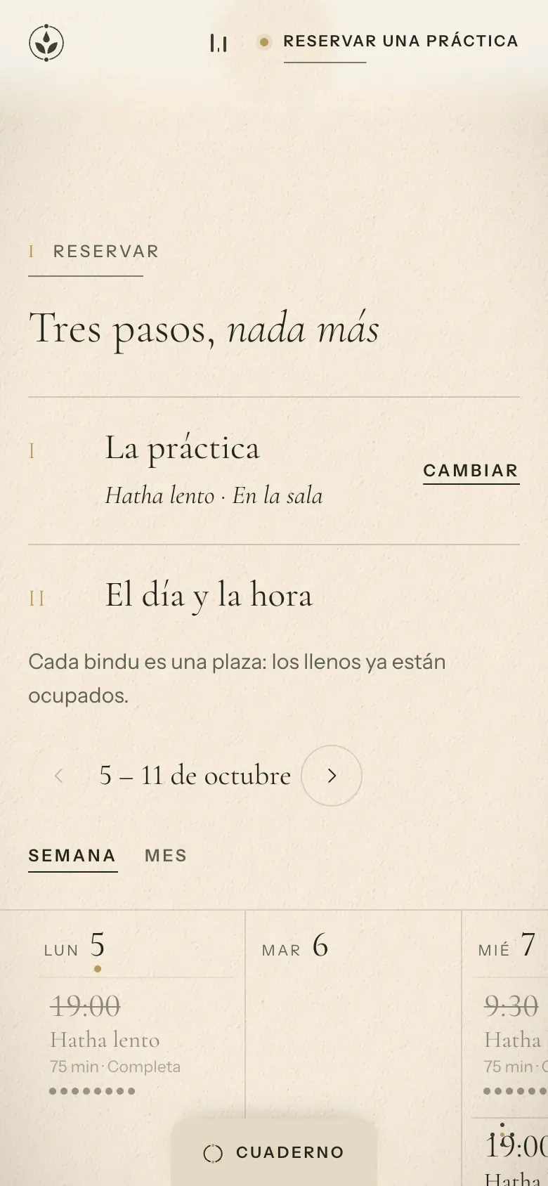
- 1Three steps, stated up front
- 2Seats as bindus under each day
- 3Local time and live capacity, in words
Courses, a field notebook and the student app
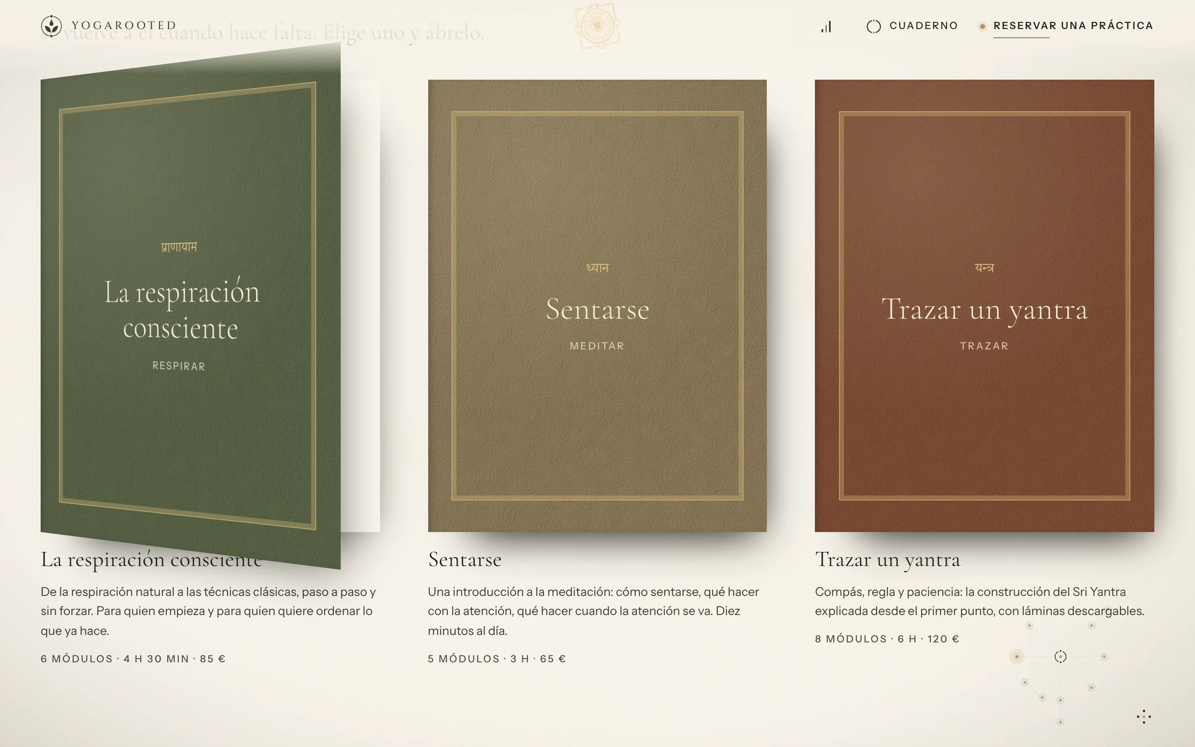
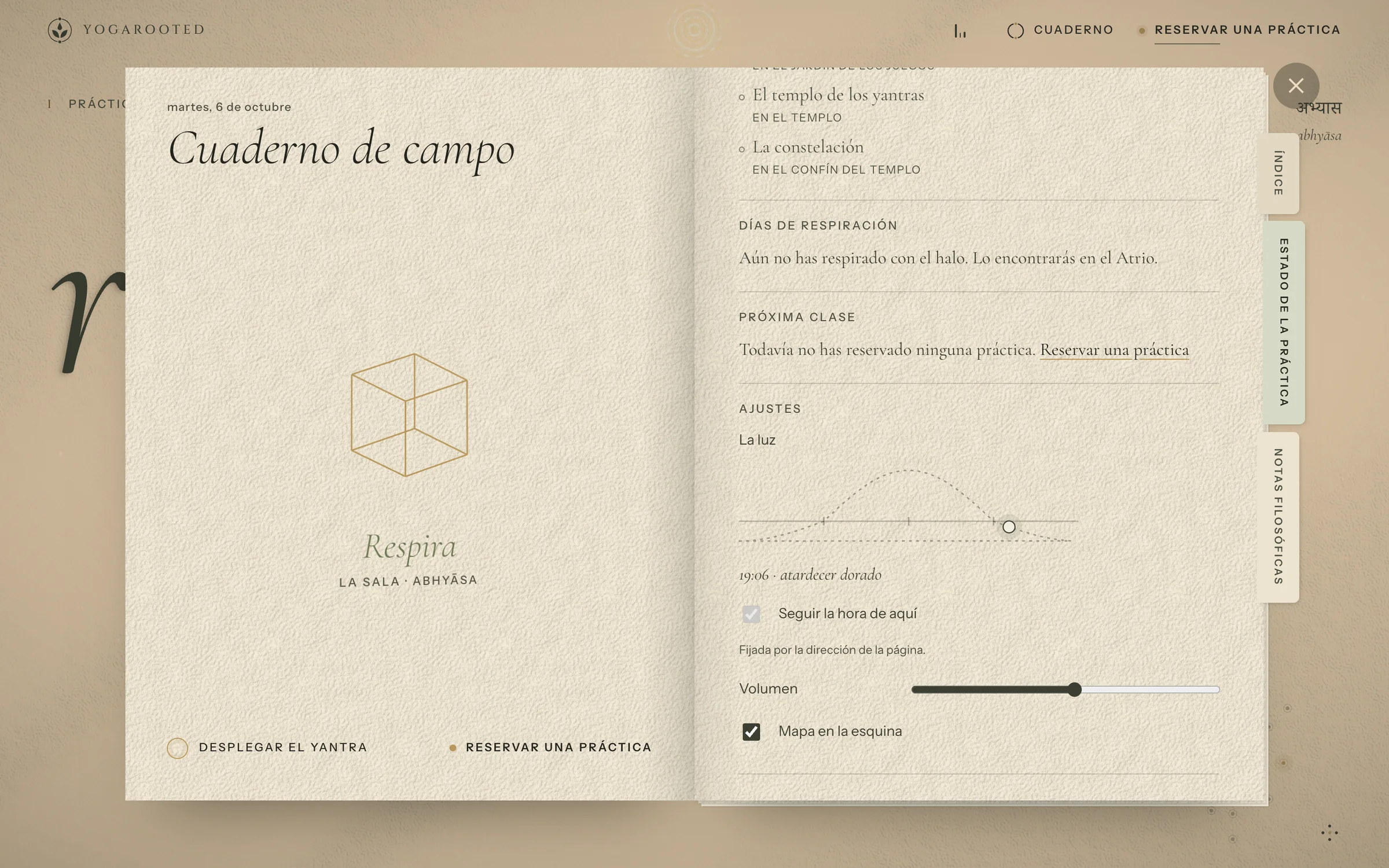
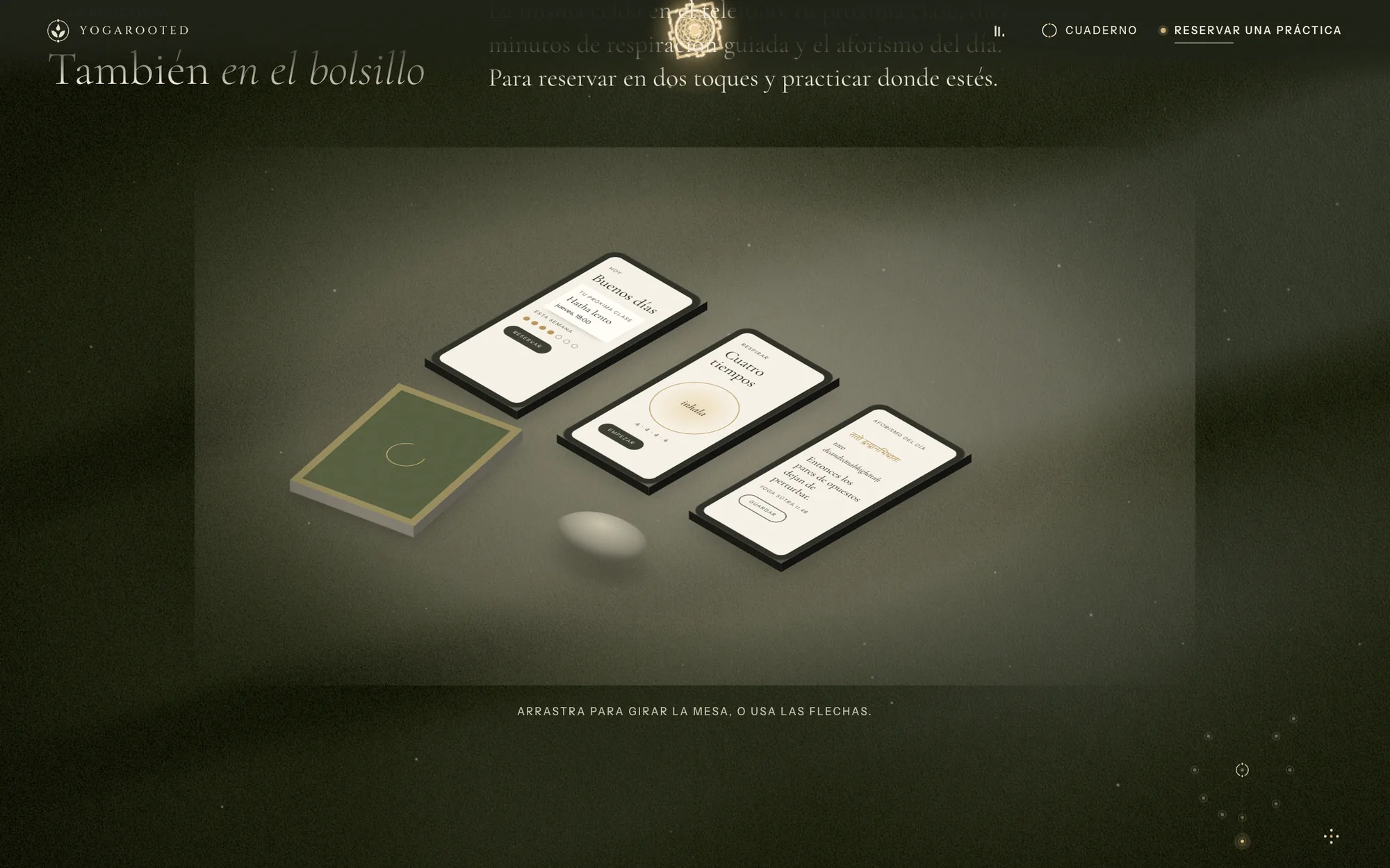
Courses are bound like manuscripts, each in a pigment from the palette. The field notebook remembers the rooms you have visited, your breathing days and your next class, and a sundial lets you fix the light. Students get their own space to rebook in two taps.
The system behind the screens
Four words guided every decision (epic, magic, aura, calm) and one tension held them together: grandeur without noise. The whole site lives on a single material, warm paper, that can become water, receive light and hold gold.
Color
All colors come from the logo and the watercolor branch. The palette is modulated by the visitor’s local hour: at night, paper becomes olive abyss and text becomes cream, and contrast is re-measured at every keyframe.
Typography
Enraizar
Display · titles · quotesHigh-contrast Garamond with real italics: the voice of a manuscript.
Hatha lento · 75 min · Quedan 2 plazas
Practical text · timetable · bookingClean and modern so practical information is never mystical.
Mūla · raíz
Inscriptions · small labelsCarved Roman capitals, used sparingly like stone inscriptions.
मूल योग यन्त्र
Sanskrit termsAlways paired with its IAST transliteration and meaning.
Grid & spacing
- Columns
- 12
- Max width
- 1440px
- Gutter
- 24px
- Base unit
- 8px
Spacing grows in Fibonacci steps (8, 13, 21, 34, 55, 89), the same proportions used to construct the yantras, so whitespace breathes rather than stacks.
Decisions, and why
-
01
The logo is the script of the opening
WhyA drop, two leaves, an open circle and two points become the first thirteen seconds: the brand is learned, not shown.
Instead of
A generic hero video of a sunset. -
02
Gold only where light touches
WhyScarcity keeps it sacred; overuse turns it into decoration.
Instead of
Gold borders on every card and button. -
03
Seats drawn as bindus
WhyCapacity becomes part of the visual language: honest scarcity, no countdowns.
Instead of
“Only 2 left!” badges in red. -
04
Magic never hides the timetable
Why“Reserve a practice” stays in the header of every room, in plain words.
Instead of
Booking buried at the end of the experience.
Schema
- 1A drop: condenses on the leaf and falls at 4.2 s
- 2Two leaves: the watercolor branch that opens the scene
- 3An open circle: the ripple that turns paper into water
- 4Two points: the bindus: origin and destination, the yantra’s center
- Art direction & visual concept
- Immersive website + 2D fallback
- Booking & checkout flow
- Admin app (7 modules)
- Invoicing & reports
- Student area
- Memberships with automatic renewal and pause.
- Waitlists that fill freed seats automatically.
- English version for international retreat guests.