Gifting · Shopify redesign · Catalog · AOV
Sip’n’Fox
Tea favors, re-architected so that ordering 50 feels as easy as buying one.
- Client
- Sip’n’Fox LLC
- Sector
- Gifting · Food & beverage · DTC + B2B
- Market
- United States
- Role
- Shopify lead: build, catalog architecture, SEO
- Timeline
- 2026
- Scope
- Redesign · Catalog · Product pages · Upsells & bundles · B2B tiers · SEO
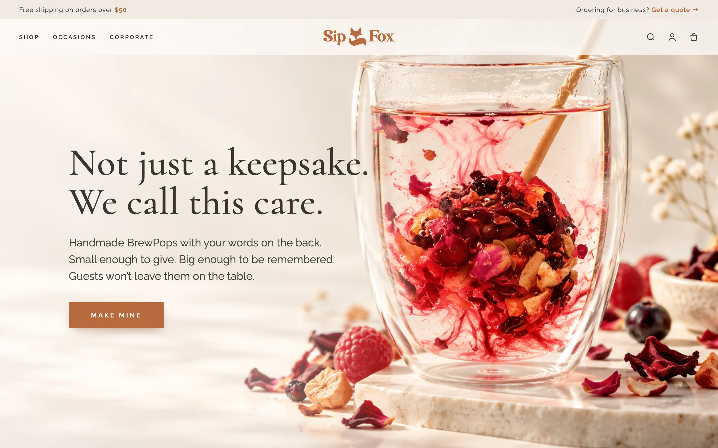
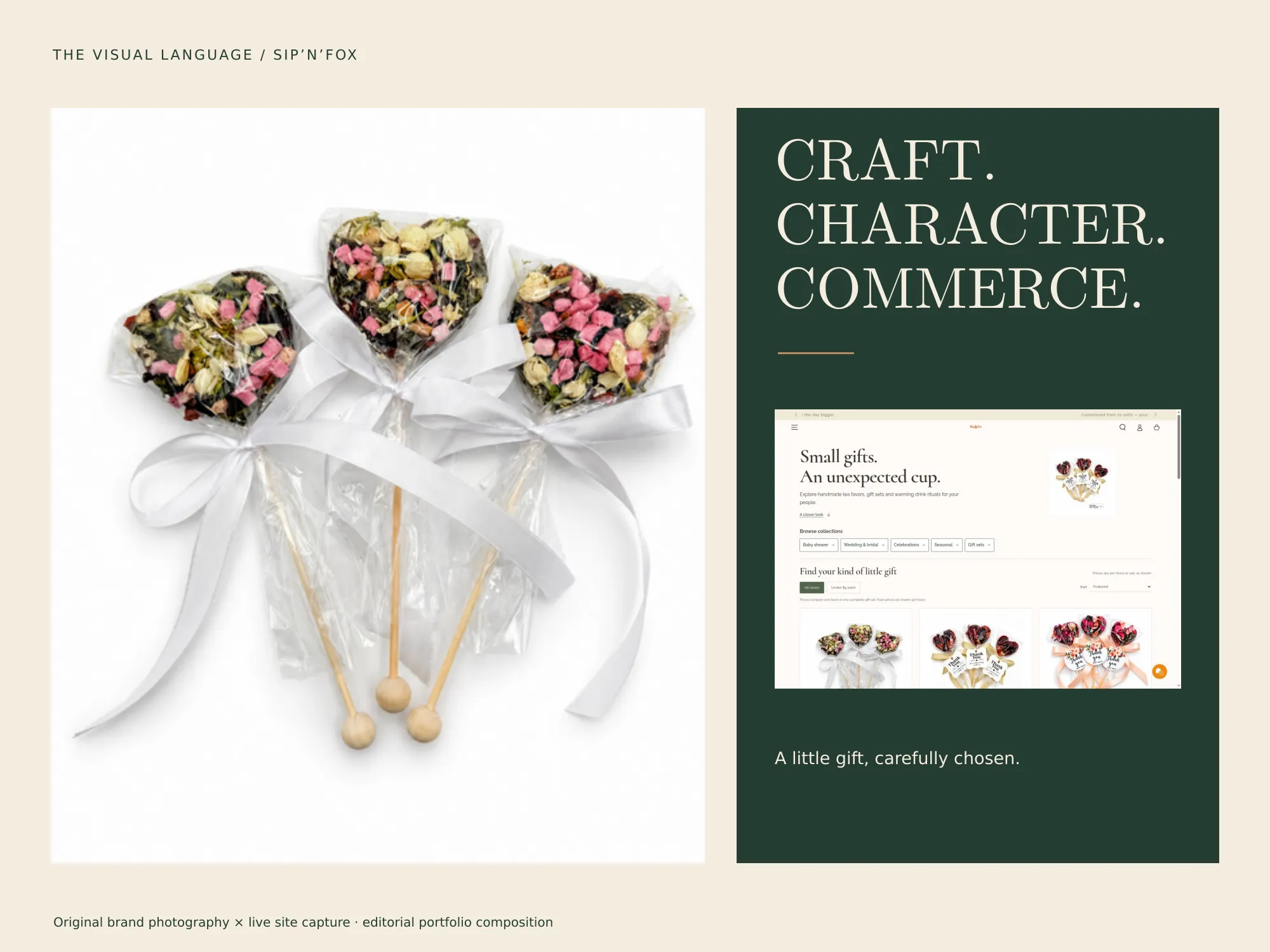
Sip’n’Fox makes BrewPops, handcrafted tea pops that bloom in hot water, sold as personalized favors for baby showers, weddings and corporate gifts in the US. I audited the store, wrote a modular proposal and delivered three modules: a full redesign on a new premium theme, product pages rebuilt for conversion, and a layer of upsells, bundles and B2B pricing that lifts every order.
The audit found a store that had grown product by product: 78 SKUs where most were the same product in another color, 8 overlapping collections, three names for one product (Tea Bomb, TeaPop, BrewPop), $0.00 prices live on the site, emojis and “(🔴 Minimum order: 25)” inside product titles. And two very different buyers, a parent planning a shower and an office manager ordering 300 branded gifts, landing in the same place with no path for either.
Separate the two journeys at the front door, then design a product model where every decision lives in exactly one place.
From audit to a 73-hour plan
Instead of a vague “redesign”, I turned the audit into a modular proposal: every task named, estimated in hours and tied to a business reason. The founders could approve module by module, pay half up front and half on delivery, and see exactly what they were getting. Three modules went ahead first.
Redesign & new premium theme
- Premium OS 2.0 theme, brand tokens, mega-menu
- Dual navigation: shop by occasion + corporate
- Homepage rebuilt in 8 sections
- 8 legacy collections → 6 clean ones, with SEO
- Collection template with B2B strip and filters
- Mobile QA, cross-browser, Core Web Vitals
Product pages & conversion
- 78 SKUs merged into ~18 products, $0.00 errors fixed
- Native variant architecture across 6 templates
- Flavor, ribbon and sticker fields, step by step
- Conversion copy and four info accordions
- B2B strip under every Add to Cart
Upsells, bundles & volume pricing
- Bundle selector on every product page
- “Complete the Magic” teapot cross-sell
- Cart drawer with free-shipping bar and gift note
- Bronze → Platinum corporate tiers
- Post-purchase one-click upsell
- Wedding Kit & Corporate Pack bundles
The option ladder
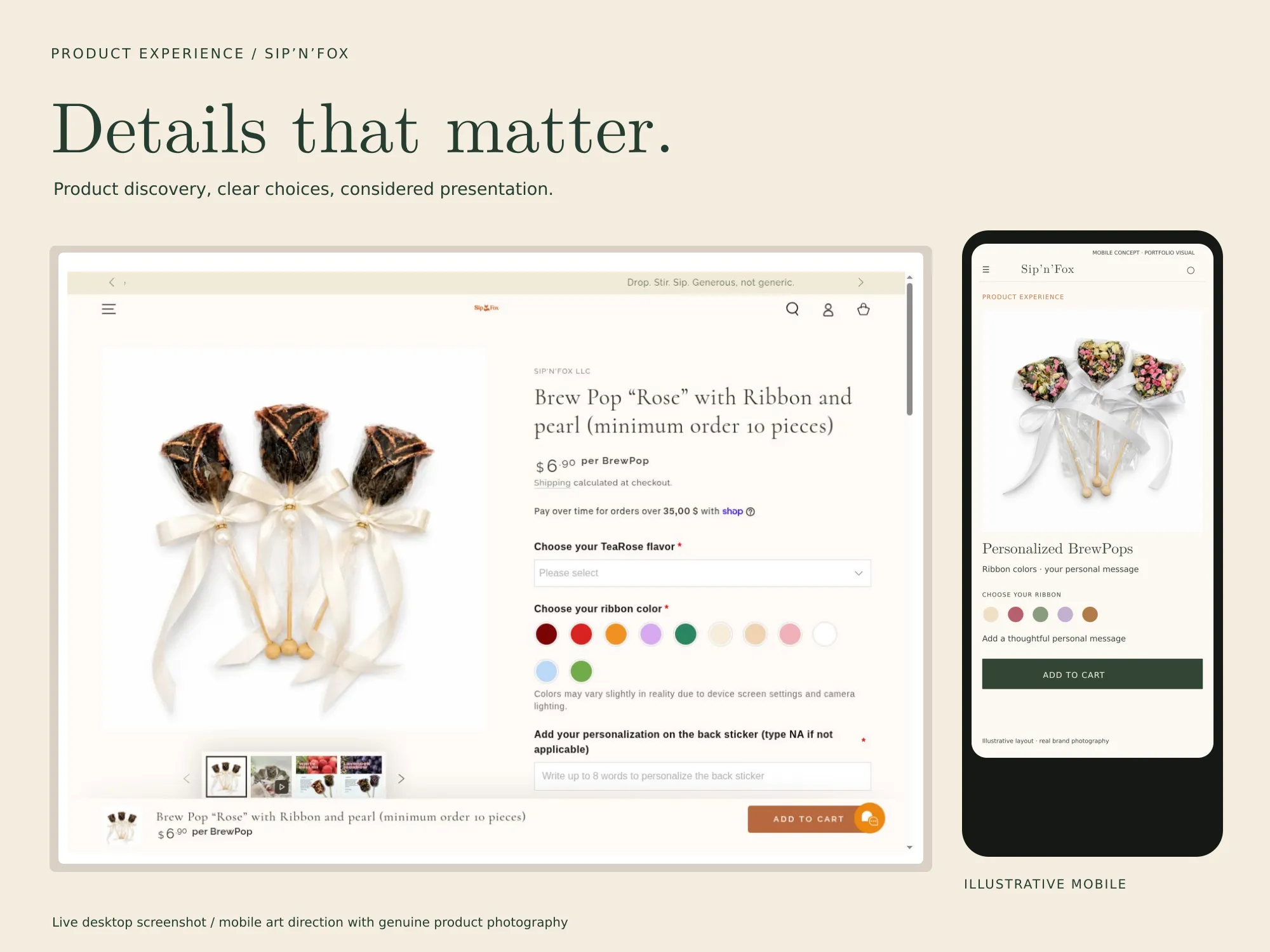
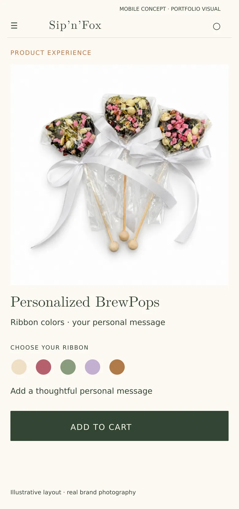
On the product page, choices appear in a fixed order (shape, quantity, ribbon, flavor, message) with the price updating as you go. Bundles are pre-selected at the sweet spot, and a one-click teapot cross-sell sits right before the cart button.
- 11 ribbon colors as visual swatches
- 5 tea flavors, 60-character message
- Minimum quantity enforced, not explained
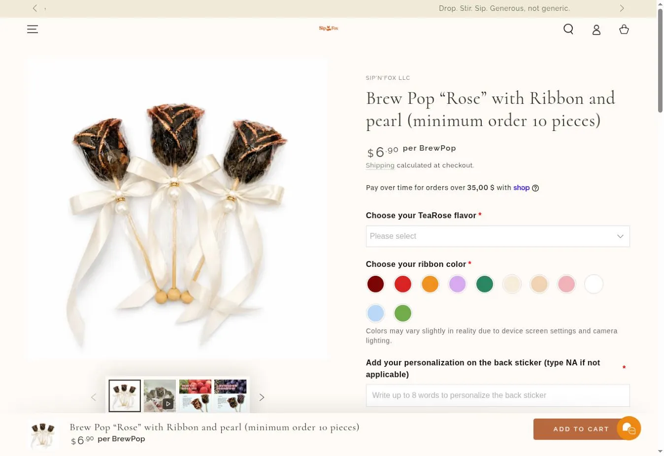
- 1Price per piece: the unit people compare
- 2Flavor as a required choice
- 311 ribbon colors as swatches
- 4Message capped at 8 words
- 5Sticky add-to-cart with live price
Bigger orders, without discounting the brand
Average order value was left to chance. I built a layer that lifts it at every step: a bundle selector pre-set to the sweet spot (×3, −10%), a one-click “Complete the Magic” glass-teapot cross-sell, a cart drawer that shows how far you are from free shipping, a gift note, and a single post-purchase offer for retail orders under $100. Try the cart:
- Corporate tiers: Bronze 25–49 · Silver 50–99 (free card design) · Gold 100–499 (+ branded ribbon) · Platinum 500+ (custom box, quote only)
- Pack 50 and Pack 100 with “Request a quote” instead of Add to Cart
- Wedding Kit and Corporate Pack as ready-made bundles
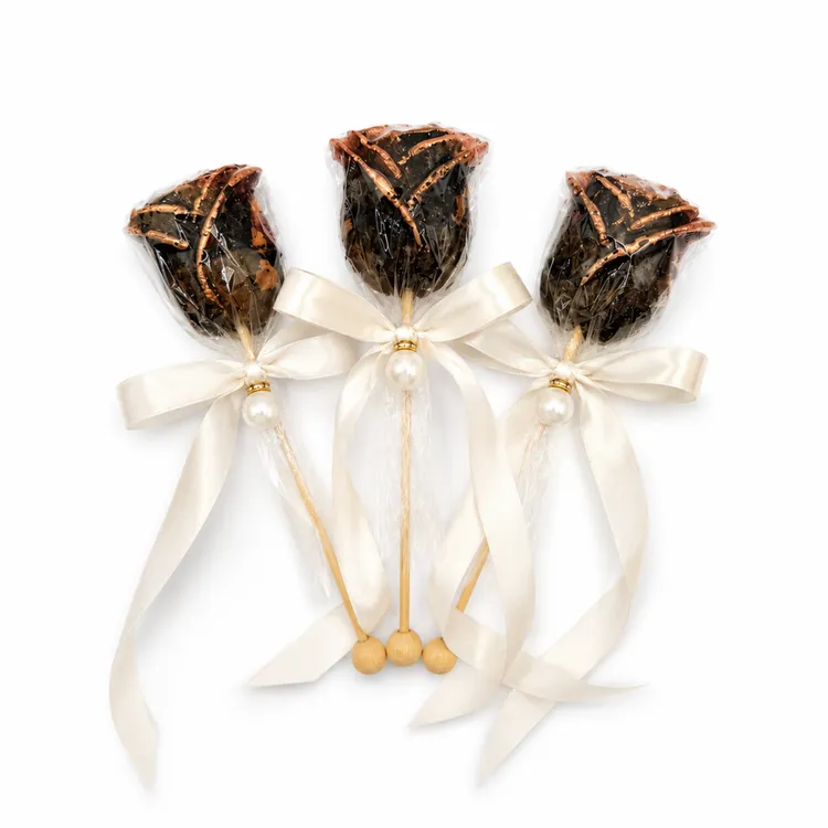
Search that understands occasions
People search for “baby shower favors” and “wedding tea favors,” not “BrewPop.” Collections were rebuilt around those intents, with descriptive copy, clean URLs and product schema. Merging duplicate products concentrated ranking signals instead of splitting them, and every retired URL got a redirect.
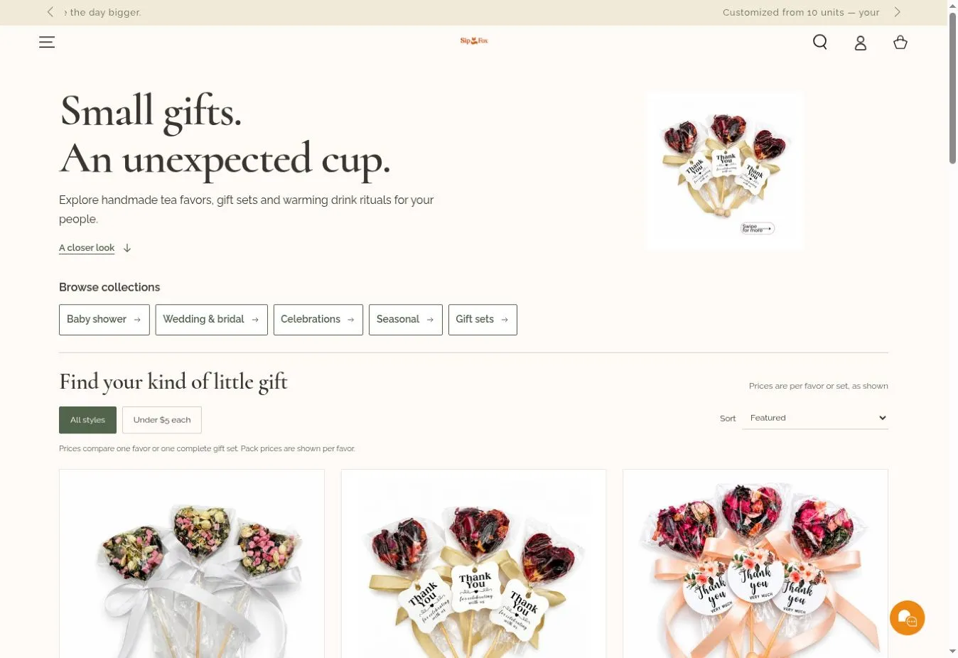
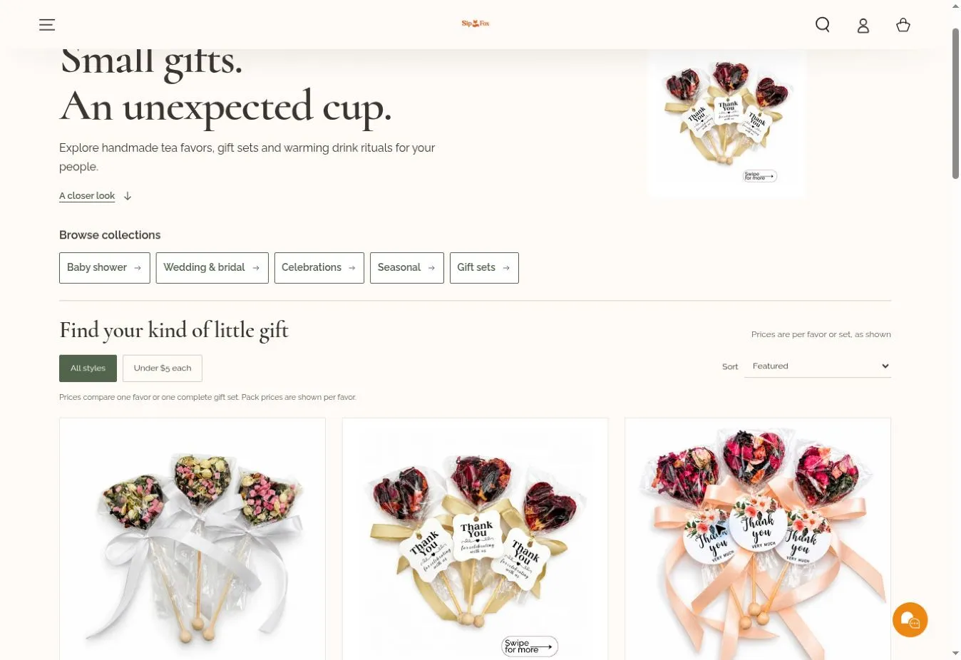
- 1Sell the moment, not the product
- 2Five doors, by occasion
- 3A budget filter for favors
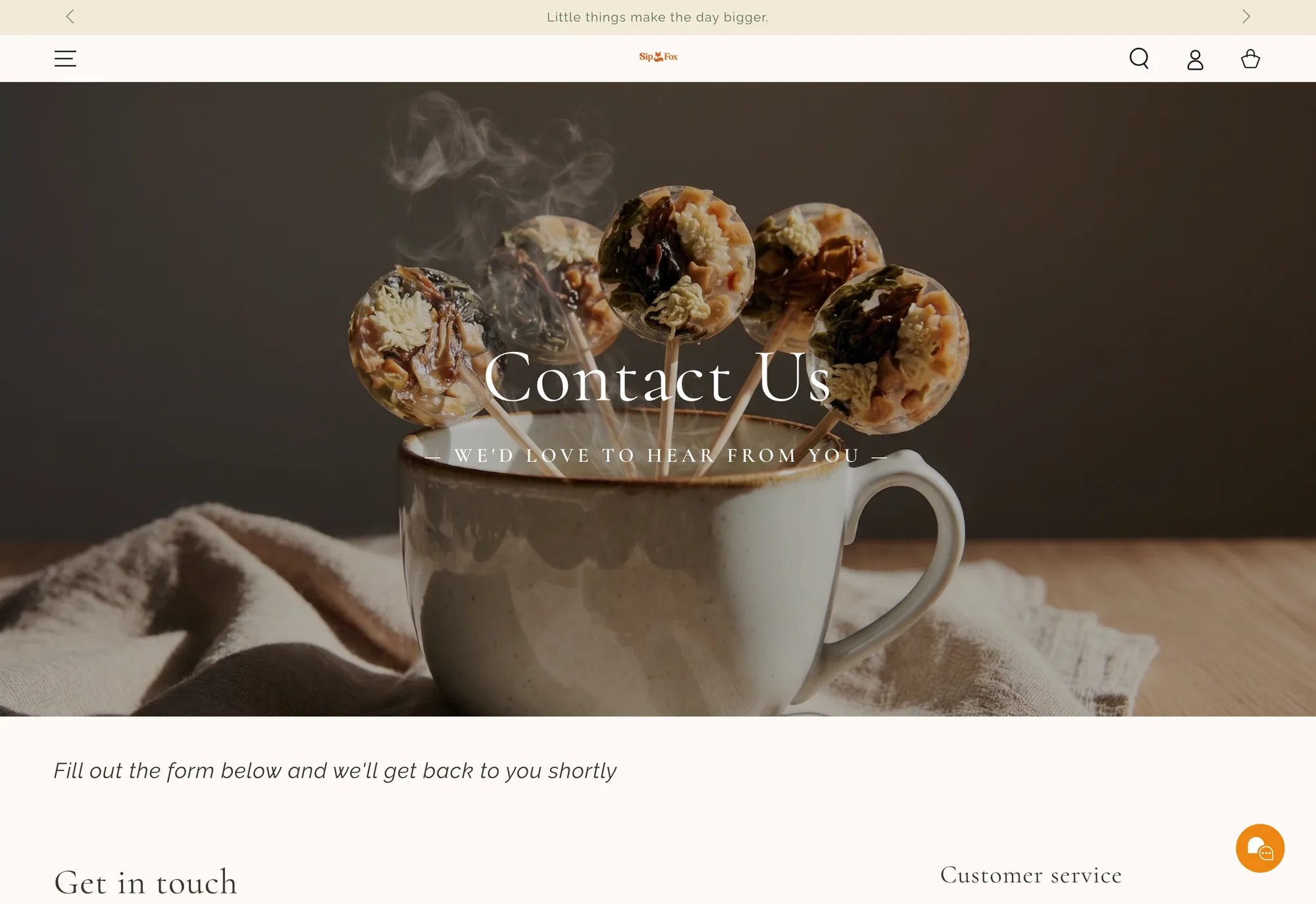
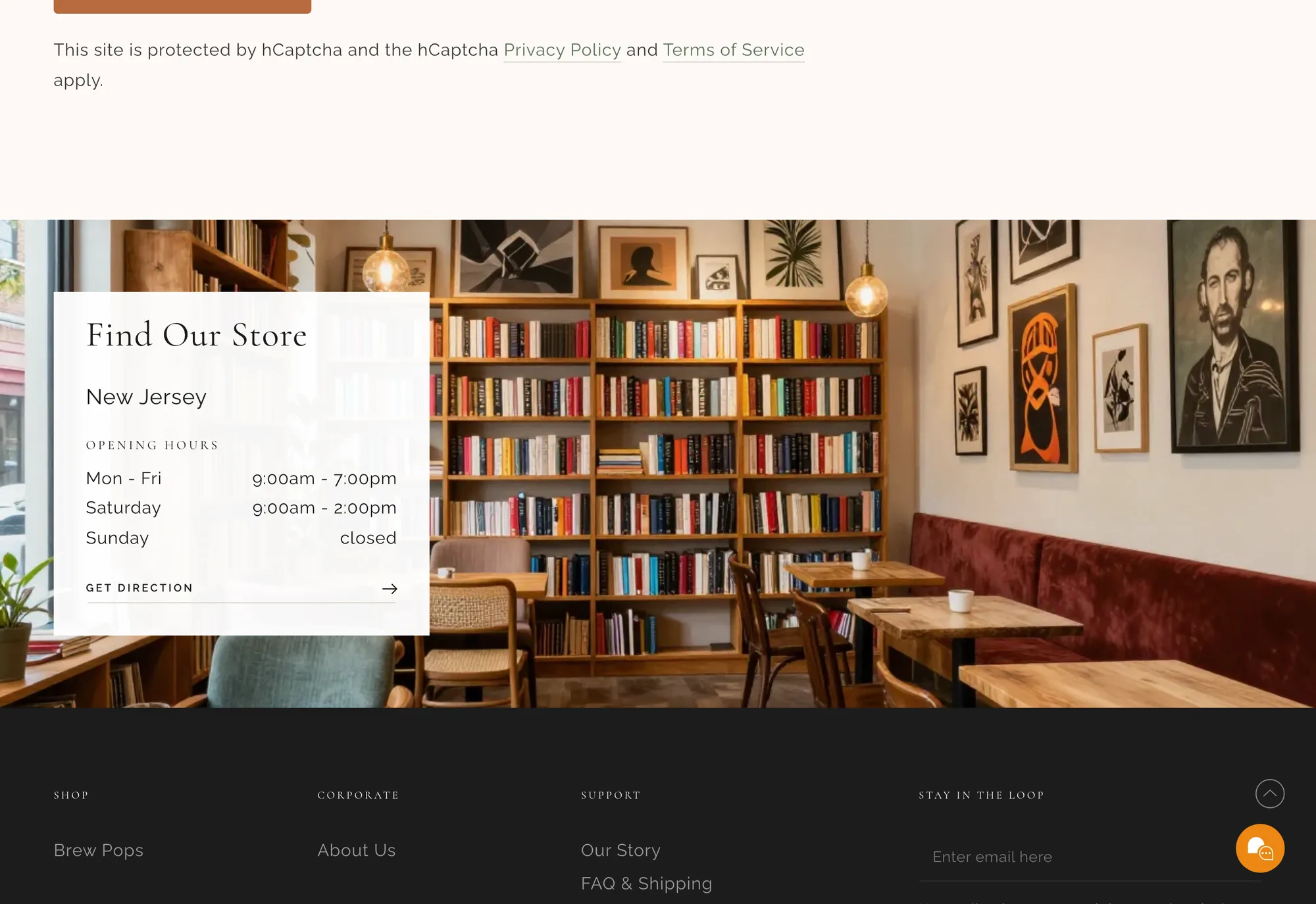
- 4Brand photography carries every page, even contact
The system behind the screens
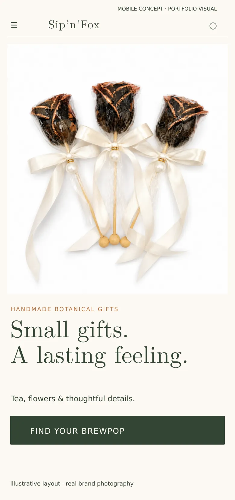
Sip’n’Fox sells something small, handmade and emotional, at quantities of 25 to 300. The design had to stay gift-like and warm while carrying a lot of structure: options, minimums, personalization and a B2B path.
Color
The fox orange is reserved for the one action that matters on each screen. Text is a brown-black “steeped tea” so the page never feels clinical next to the product photos.
Typography
Small gifts. An unexpected cup.
Headlines · product namesA calligraphic serif for the emotional layer: occasions, names, messages.
Add to cart · Minimum 25
Buttons · labels · navigationGeometric capitals for the functional layer: rules, quantities, actions.
Grid & spacing
- Columns
- 12
- Max width
- 1200px
- Gutter
- 24px
- Base unit
- 4px
Option rows sit on a 12 px rhythm so six choices fit above the fold on a laptop without feeling cramped.
Decisions, and why
-
01
Choices in a fixed order
WhyShape → quantity → ribbon → flavor → message mirrors how people plan an event.
Instead of
All options visible at once in a long form. -
02
Gender and occasion solved in navigation
WhyOne less decision on the product page (Hick’s law).
Instead of
A “Boy / Girl” variant on every product. -
03
Bundles pre-selected at ×3
WhyThe middle option anchors value without discounting the single unit.
Instead of
A sitewide percentage code. -
04
B2B never shows a cart
WhyCompanies buy with a quote and an invoice, not a checkout.
Instead of
Bulk variants of 300 units in the retail store.
Schema
- Audit & modular proposal
- Premium theme redesign
- Bundles, cross-sells & cart drawer
- Site architecture (B2C + B2B)
- Catalog data model & tag system
- 6 PDP templates
- Corporate gifting hub
- SEO restructure & redirects
- Import template for the founders
- Move B2B to Shopify’s native company catalogs with tiered pricing.
- Automate the seasonal rotation calendar (Easter → Mother’s Day → Fall).
- Post-event review flow with photo UGC for social proof.