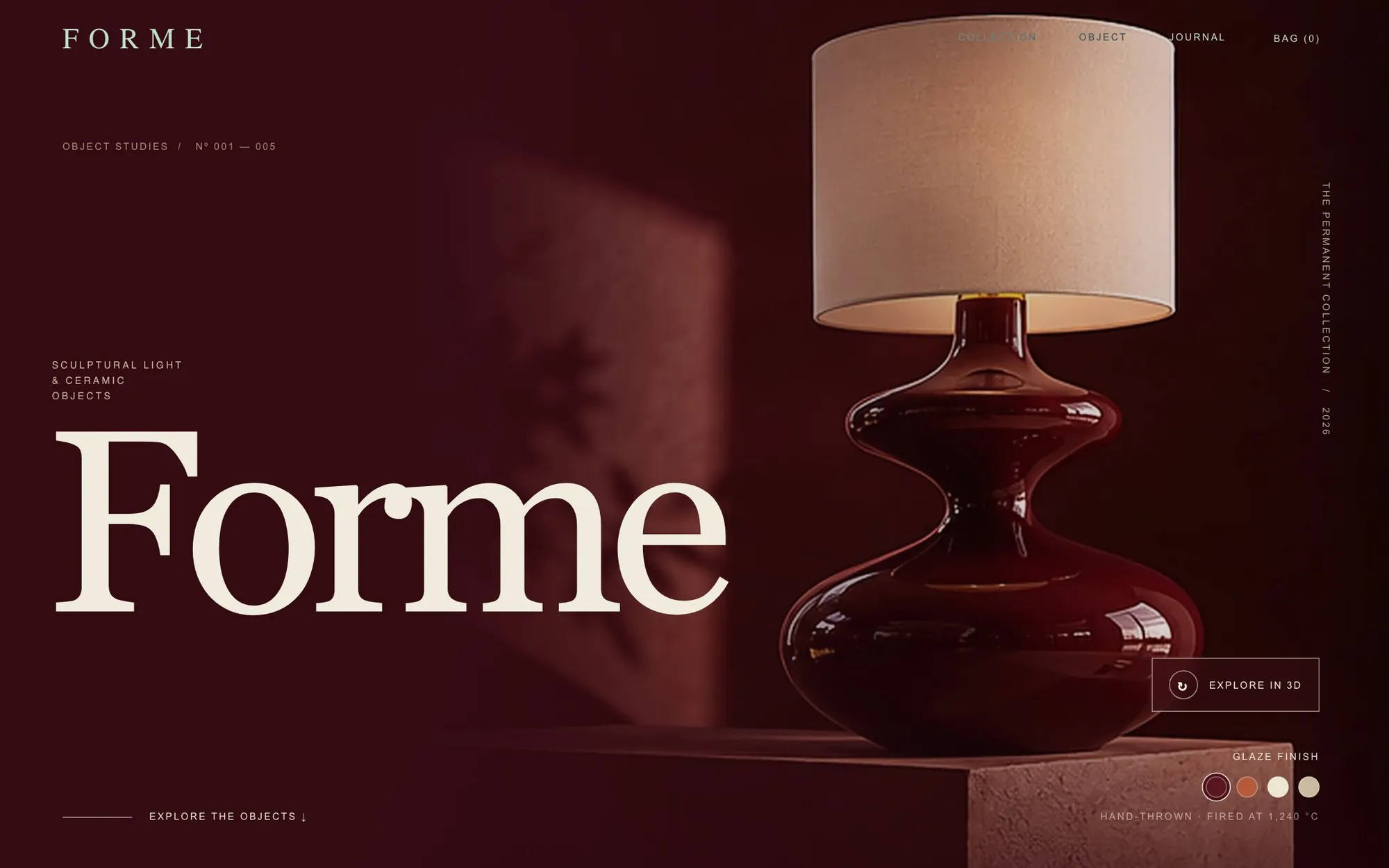
Concept · Skincare DTC · AOV design · Concept build
ONDA
How do you raise order value without discounting the brand? A skincare storefront built around that one question.
- Client
- Self-initiated
- Sector
- Skincare · DTC
- Market
- US (concept)
- Role
- Strategy, UX, art direction, front-end
- Timeline
- 2026
- Scope
- Bundle builder · Sets ladder · Limited edition · 3D product
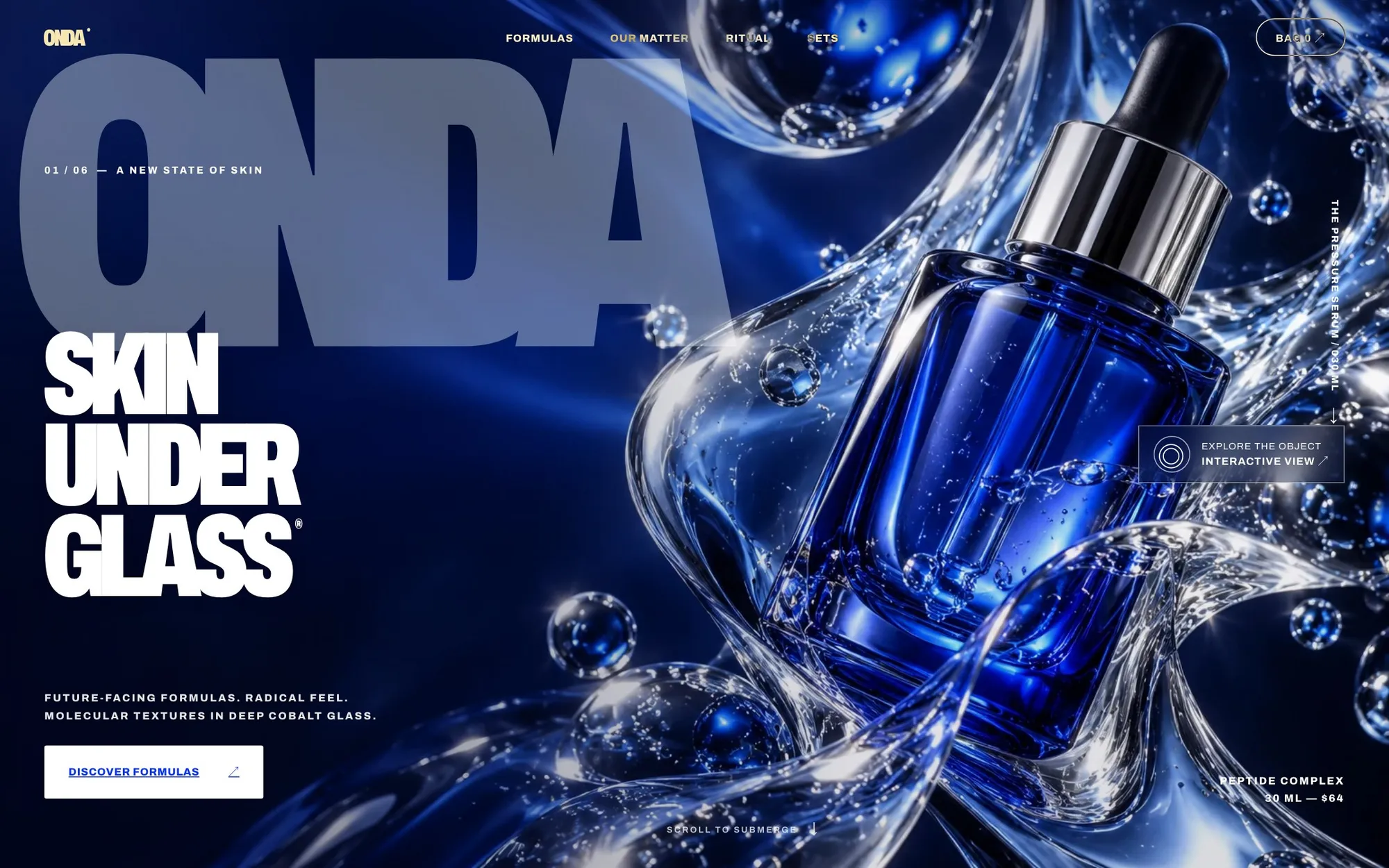
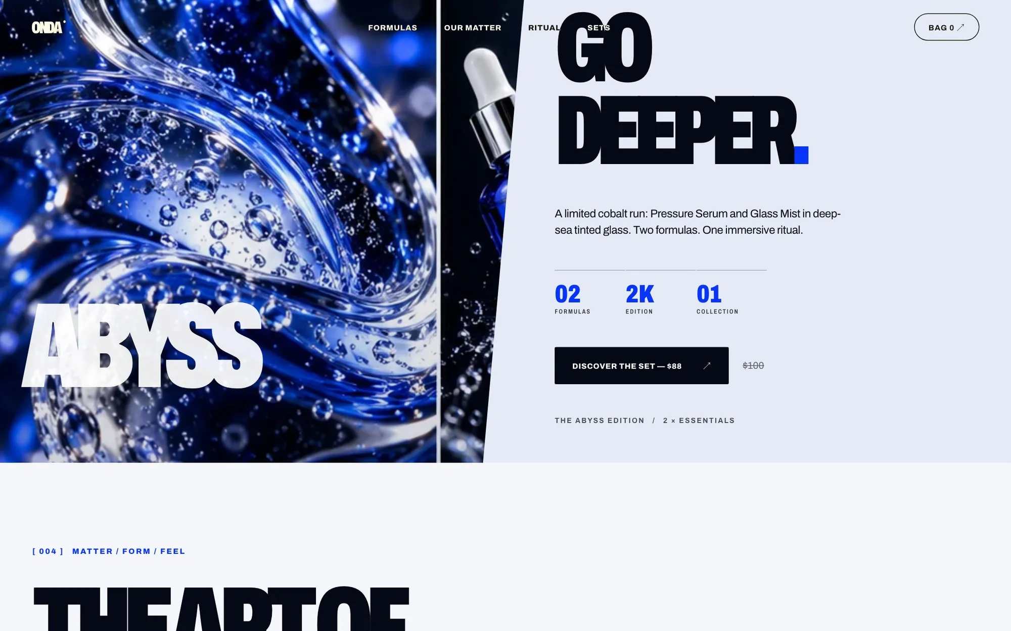
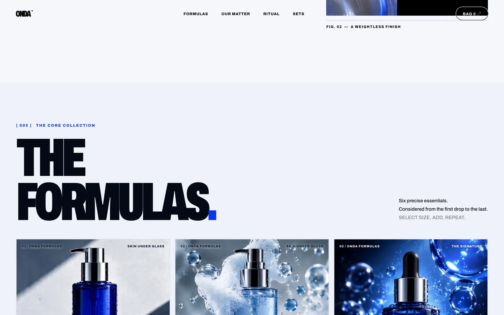
Beauty brands usually lift AOV with blanket discounts and train customers to wait for the next code. ONDA tests three alternatives: a routine builder that rewards completeness, a ladder of sets with clear anchors, and a limited edition that sells scarcity honestly.
Self-initiated concept. Brand, products and prices are fictional, built to test ideas I bring to client work.
The Ritual Architect
Three steps, one formula per step. The discount only unlocks when the routine is complete, so the customer is rewarded for buying the system, not for waiting for a sale.
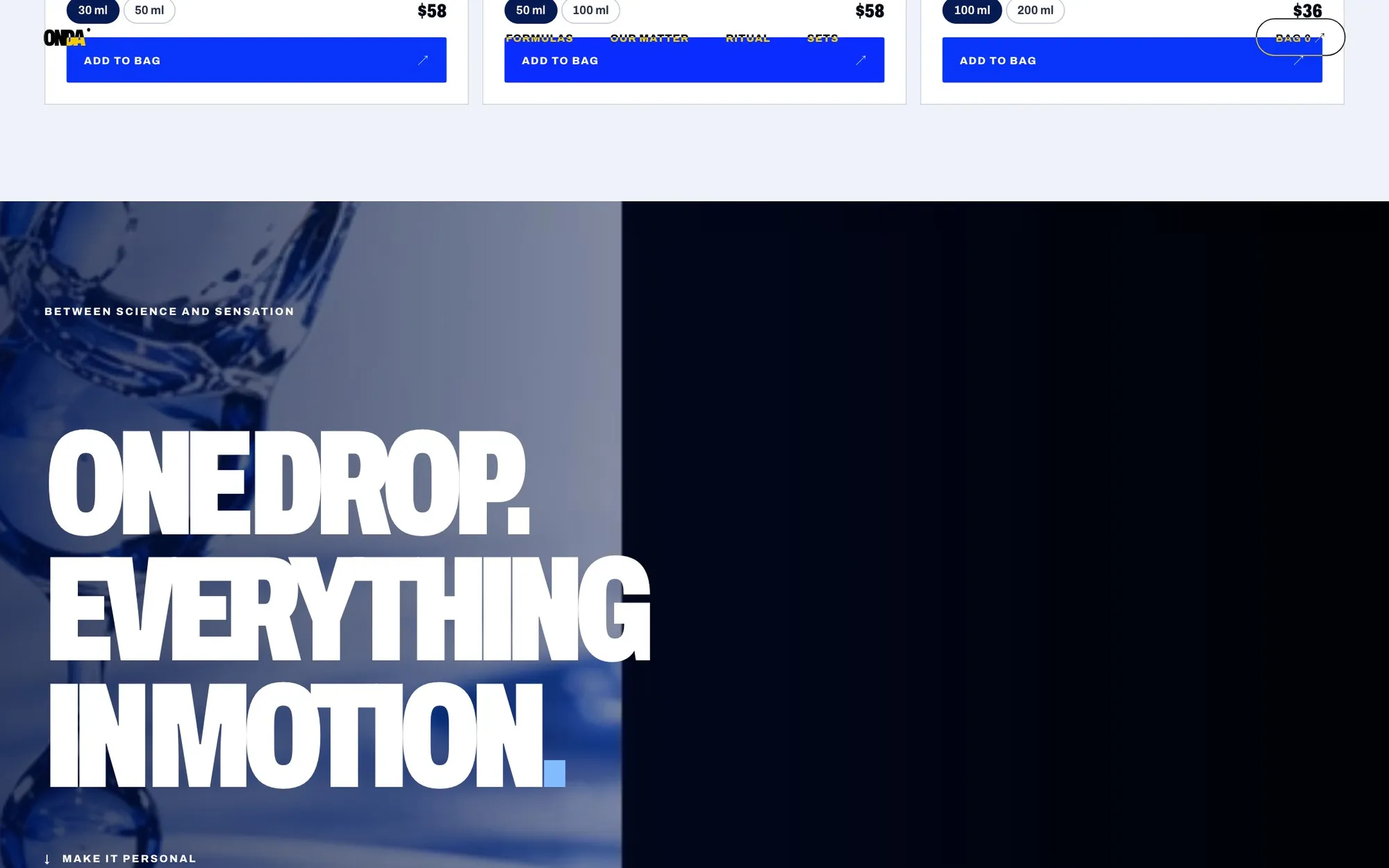
- 1Add from anywhere: size, add, repeat
A ladder, not a menu
Duo, Trio, Full set: each step shows exactly what you add and what you save. The middle option is the one most people should buy, and the page says so.
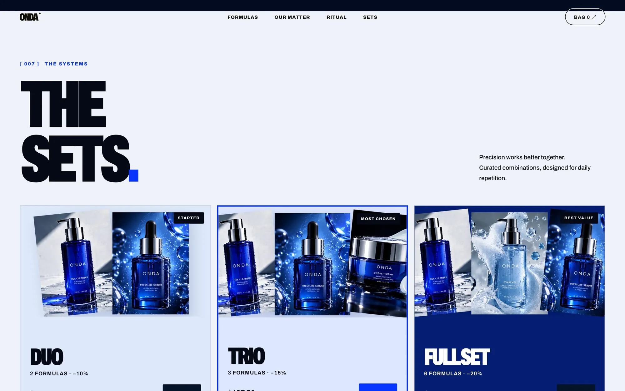
- 1“Most chosen” on the middle option
- 2Each step states its saving
- 3Full set: the anchor
Product as object
A draggable 3D bottle, macro textures and a scroll that “submerges” you into the formula. Premium positioning has to be felt before a price is read.
The system behind the screens
Skincare is usually sold with soft pinks and whispered copy. ONDA goes the other way (cobalt glass, condensed type, laboratory precision) to make the price feel like engineering, not indulgence.
Color
One saturated blue does everything. The background is a blue-tinted white so the cobalt reads as the same material, not a sticker.
Typography
Skin under glass
DisplayCondensed black weight: big statements in little width, like a lab label.
Pressure serum · 30 ml · $64
Labels · specsOne family, two voices: the system stays coherent.
Grid & spacing
- Columns
- 12
- Max width
- 1600px
- Gutter
- 16px
- Base unit
- 8px
Product cards snap to 3 columns of 4; the middle set is offset by a border, not by size.
Decisions, and why
-
01
Reward the routine, not the wait
Why15% only unlocks when all three steps are chosen.
Instead of
A welcome code that trains customers to wait for sales. -
02
An anchored limited edition
Why$100 crossed to $88 makes the set feel like value, not discount.
Instead of
Permanent “-12%” badges. -
03
3D object before price
WhyPremium has to be felt before it is read.
Instead of
A white packshot grid.
Schema
- Brand & art direction
- Storefront prototype
- Bundle logic