Private sale · Catalogue website · Identity · No checkout
Aura Salem
A private furniture collection, presented like a museum catalogue and built to sell in person.
- Client
- Aura Salem
- Sector
- Antique & period furniture · Private sale
- Market
- Salem, Massachusetts · US
- Role
- Identity, art direction, UX writing & full build
- Timeline
- Oct 2026
- Scope
- Logo · Catalogue · Product sheets · Fit checker · Pickup planner · Inquiries
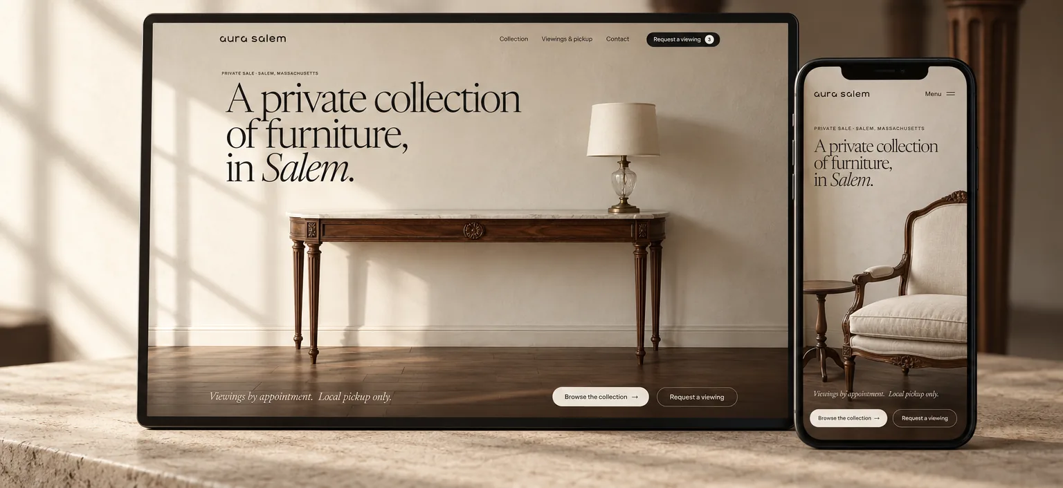
A woman spent years buying furniture for a house she never bought: carved walnut, marble, brass, cut glass. Now it has to go, without her becoming a shop. There is no cart and no shipping; the sale happens in her living room in Salem. So the website’s job is narrower and harder: send her people who already know the piece fits, how they’ll take it home, and that they want to see it.
- Measured · Lighthouse 13.5, mobile, 18 Oct 2026
- Estimate · first eight weeks, from the owner’s inquiry log and Ads Manager
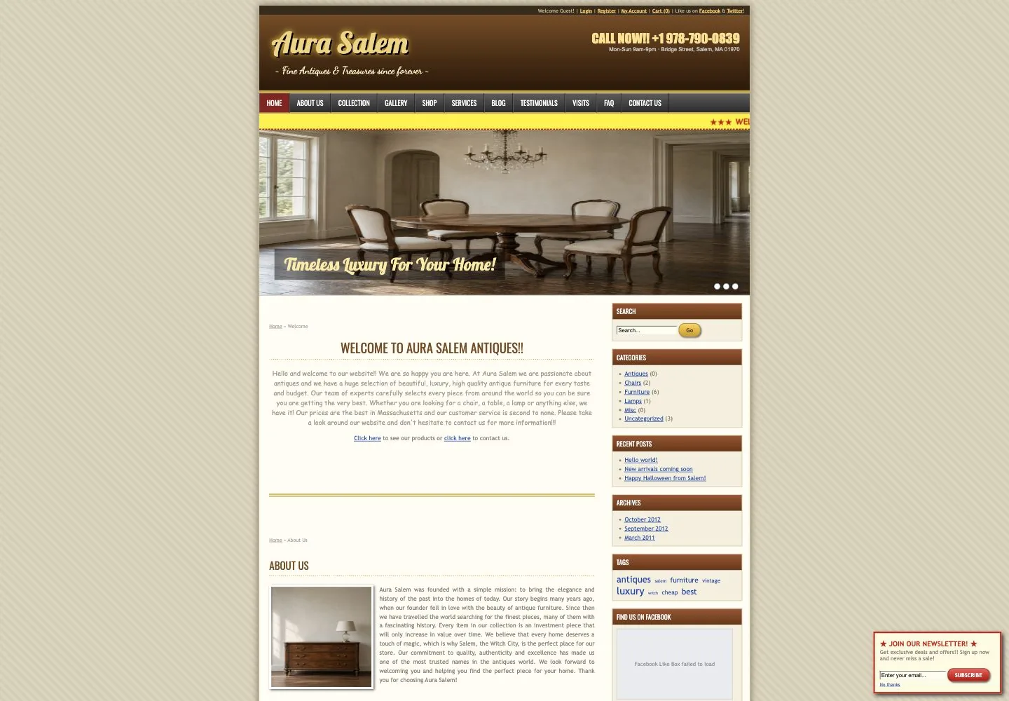
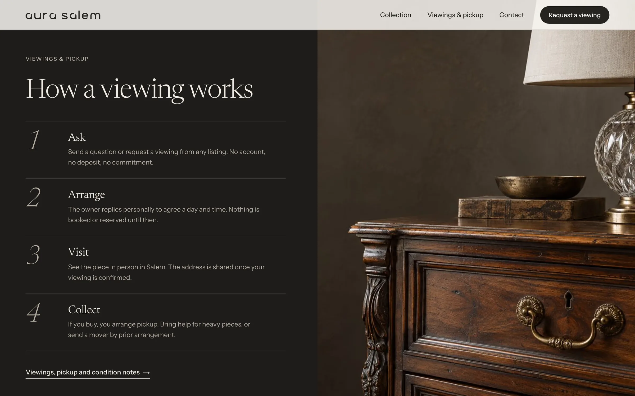
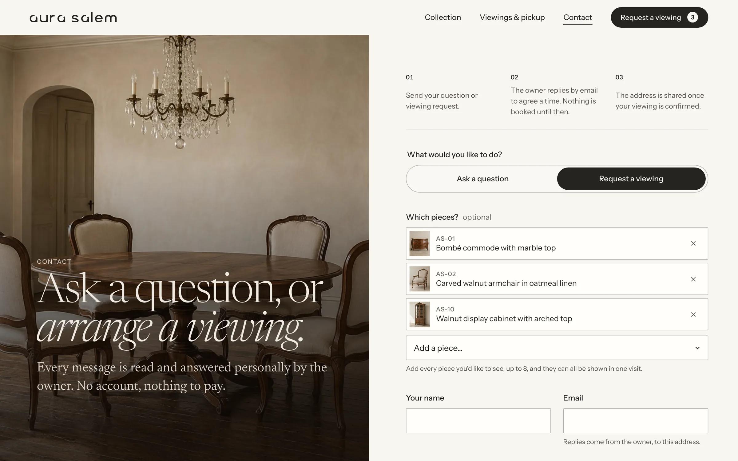
Expensive furniture, sold by a private person: no brand, no warranty, no reviews to lean on. The old site was a shop template with a cart nobody could use, “Call for price” on every piece, stretched photos, claims like “100% authentic” with nothing behind them, and her home address and phone number on every page. The real questions (how big is it, will it go through my door, how do I get it home) went unanswered, so people simply didn’t write.
Treat the collection like an auction catalogue: numbered pieces, honest facts, every claim with its source. Then answer the three questions that stop people writing, right where they come up.
From shop template to private catalogue
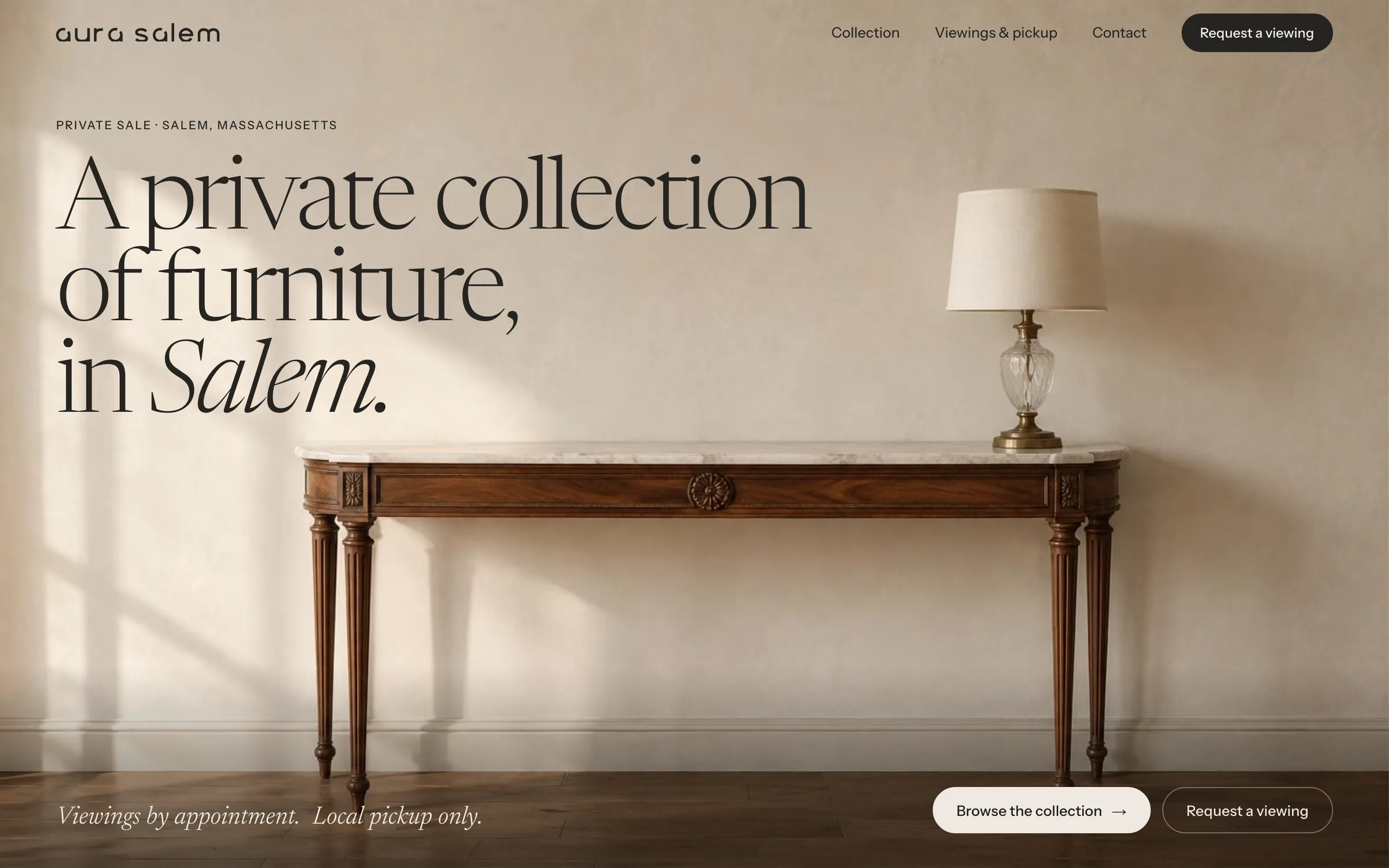
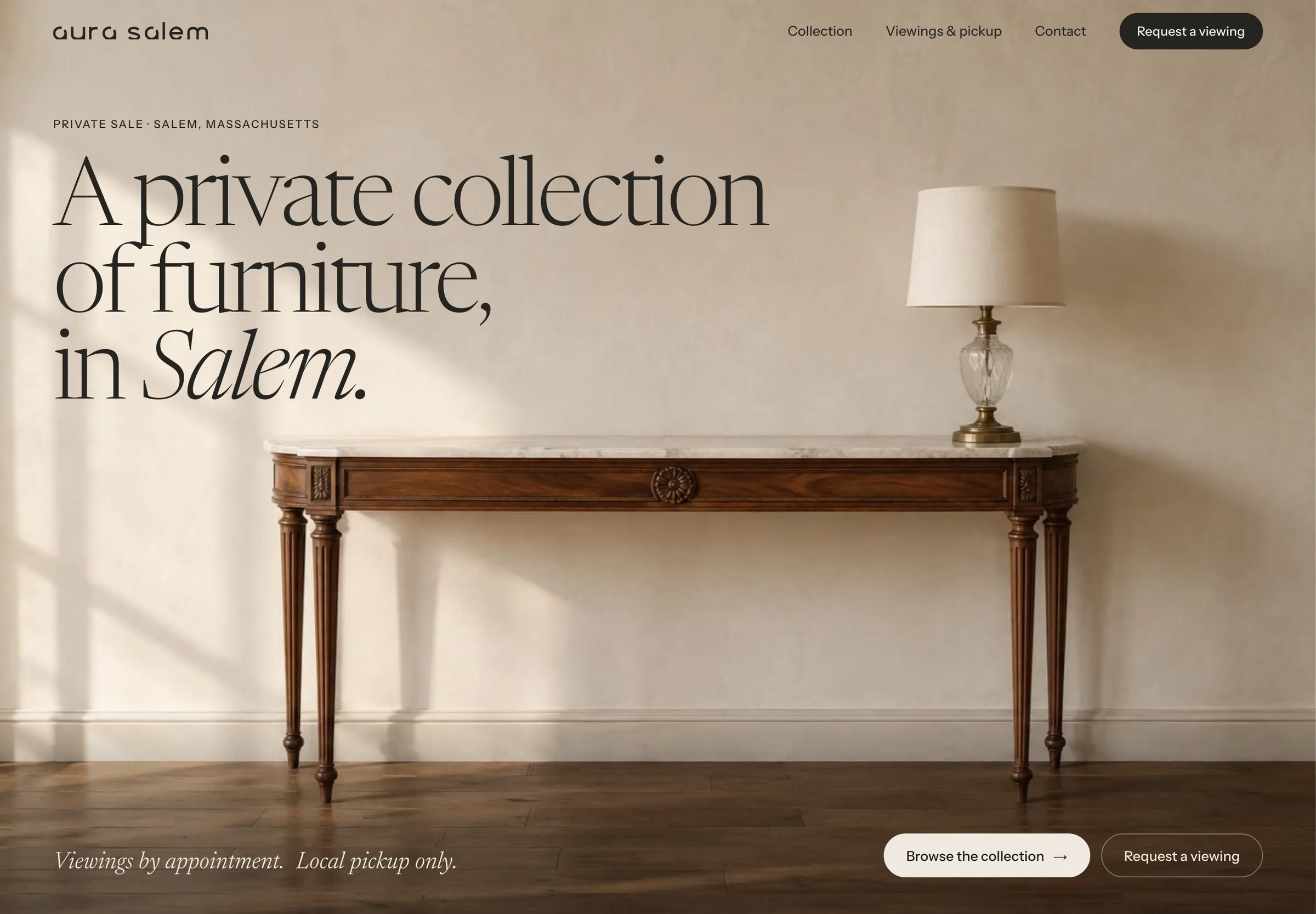
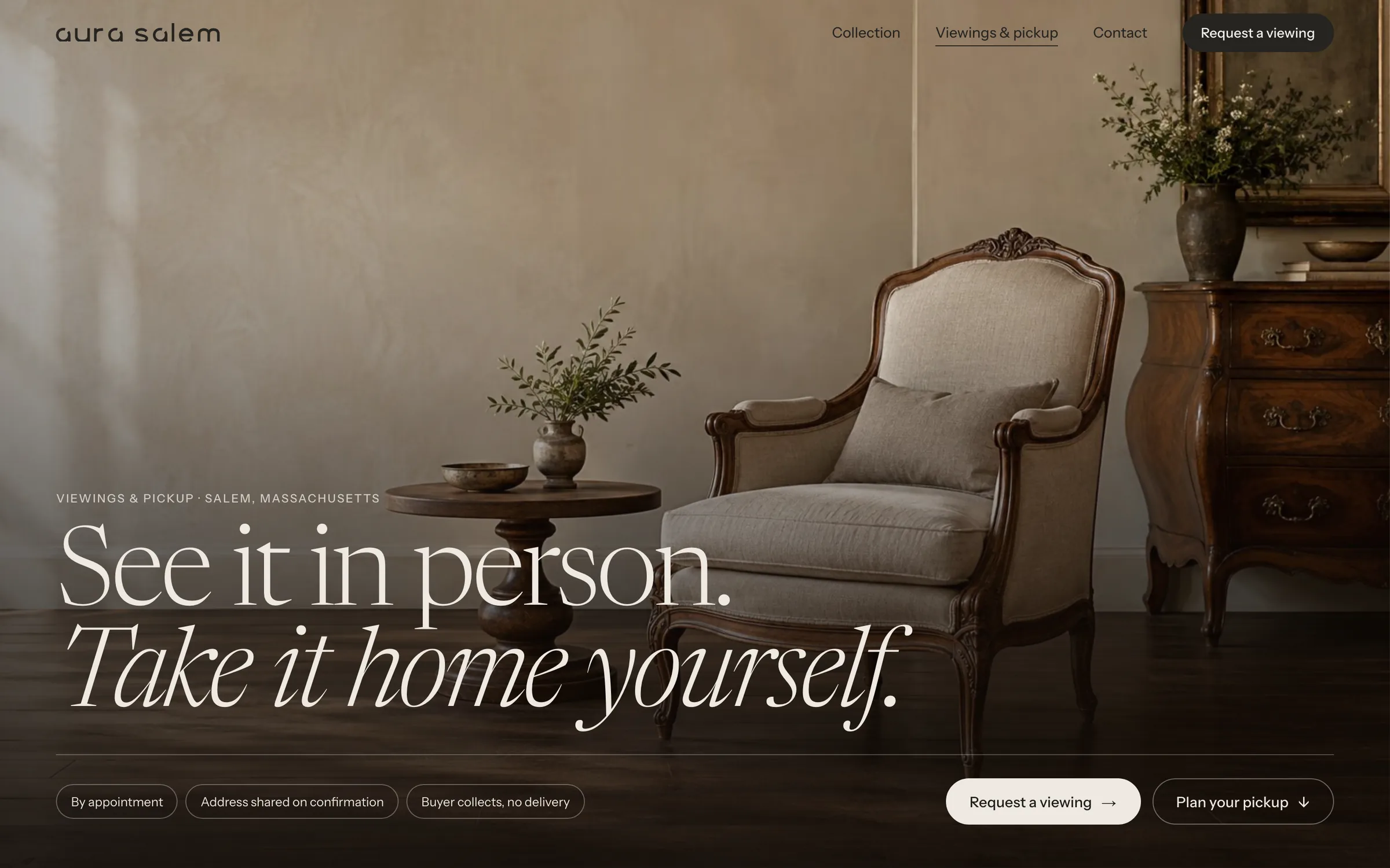
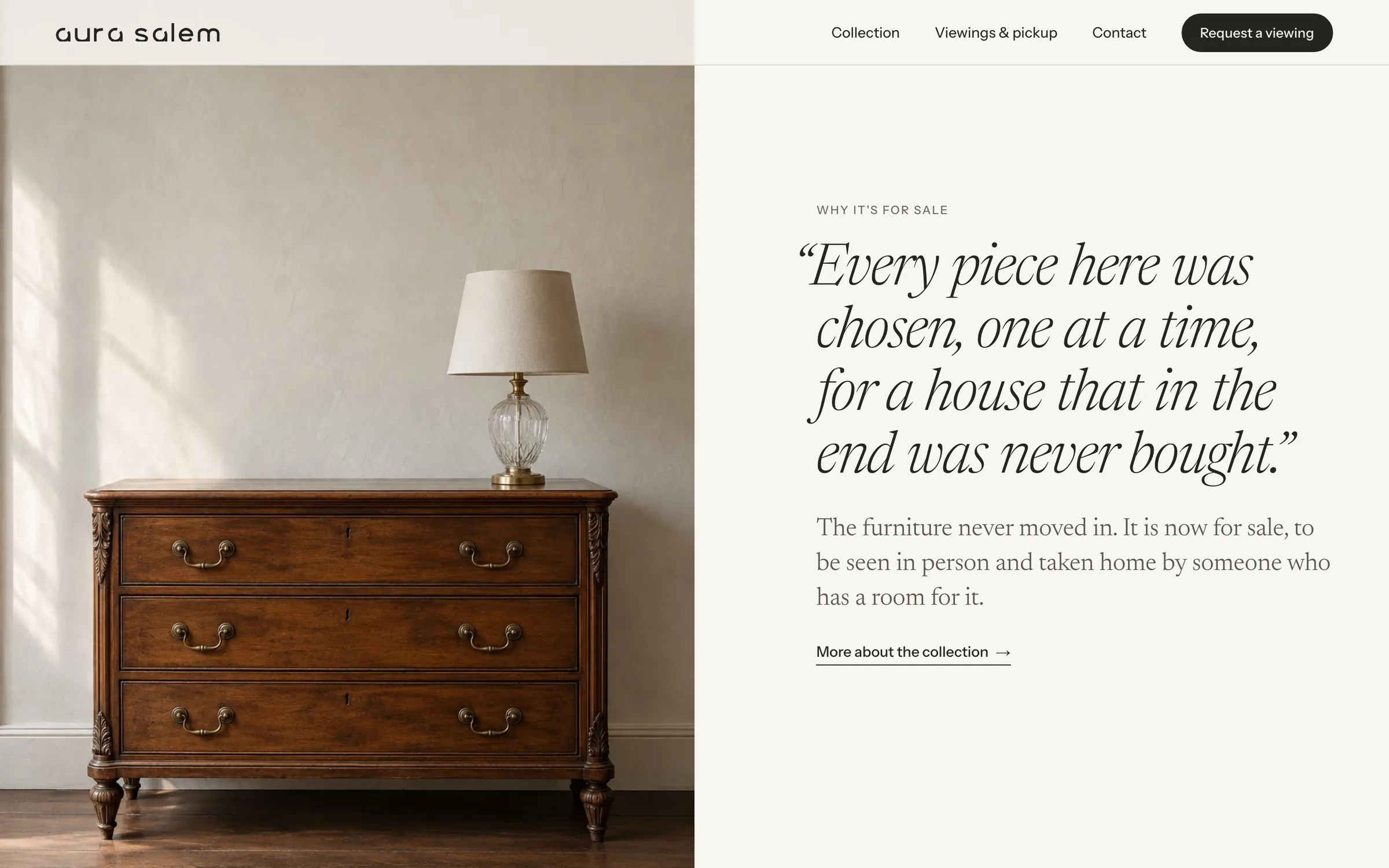
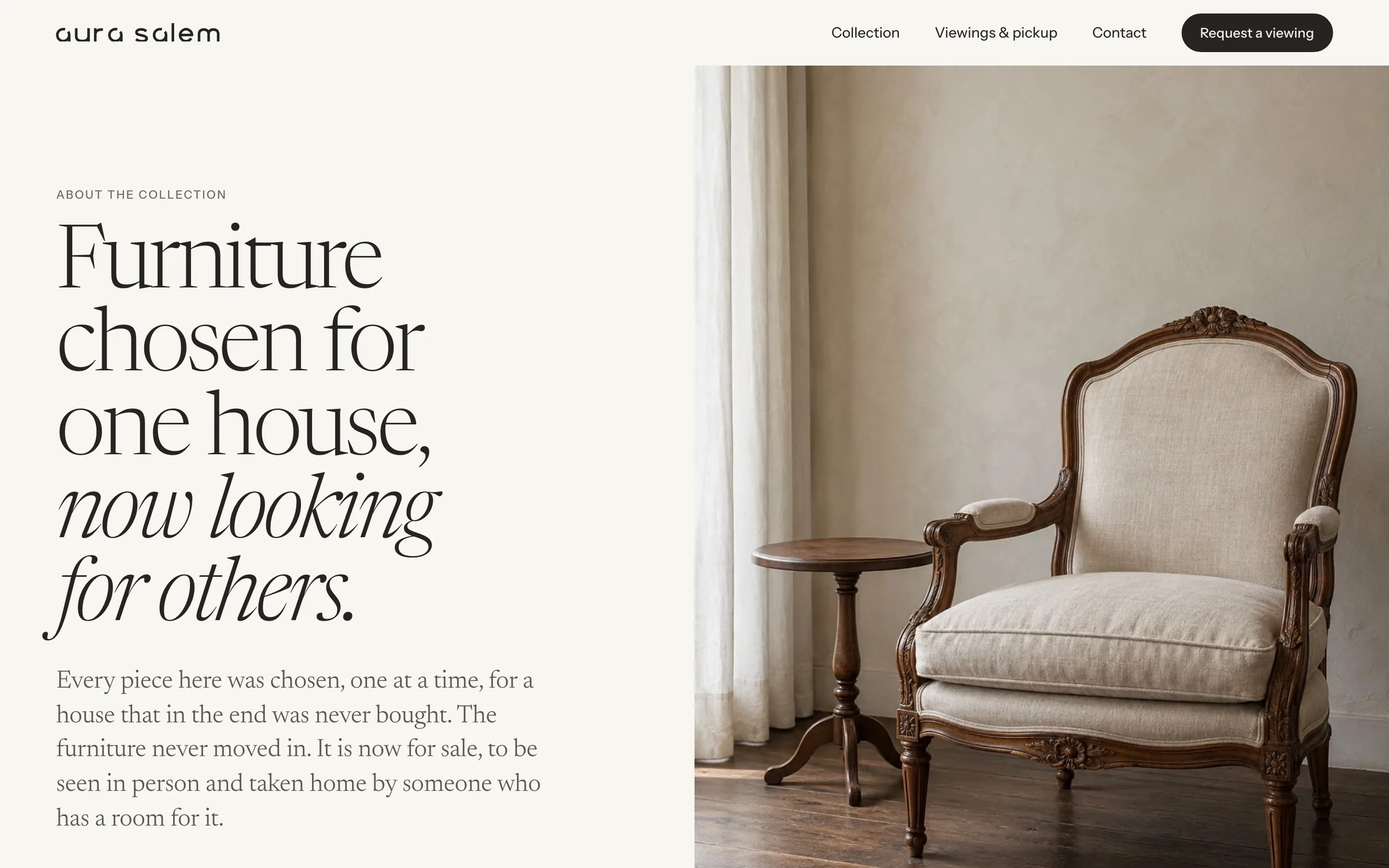
The first screen now says what this is in one sentence: a private collection, in Salem, seen by appointment and collected locally. No popup, no carousel, no marquee, no cart. Just the furniture, given the whole screen, and two clear ways in. Drag across the image:
Three stops for the eye
A first screen is a reading order, not a collage. This one is built so attention lands in three places, in that order: what this is, the furniture itself, and the one action that matters. Everything else (navigation, the lamp, the fine print) stays quiet on purpose. The attention map shows that path over the live page.
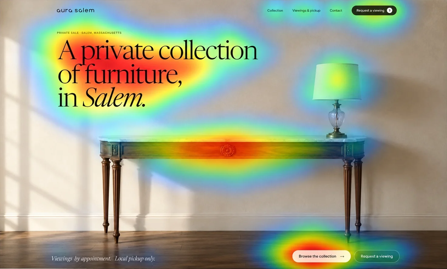
- 1The headline: what this is, in one sentence
- 2The carved rosette: then the furniture speaks
- 3One bright button, one obvious next step
A catalogue you read like a book
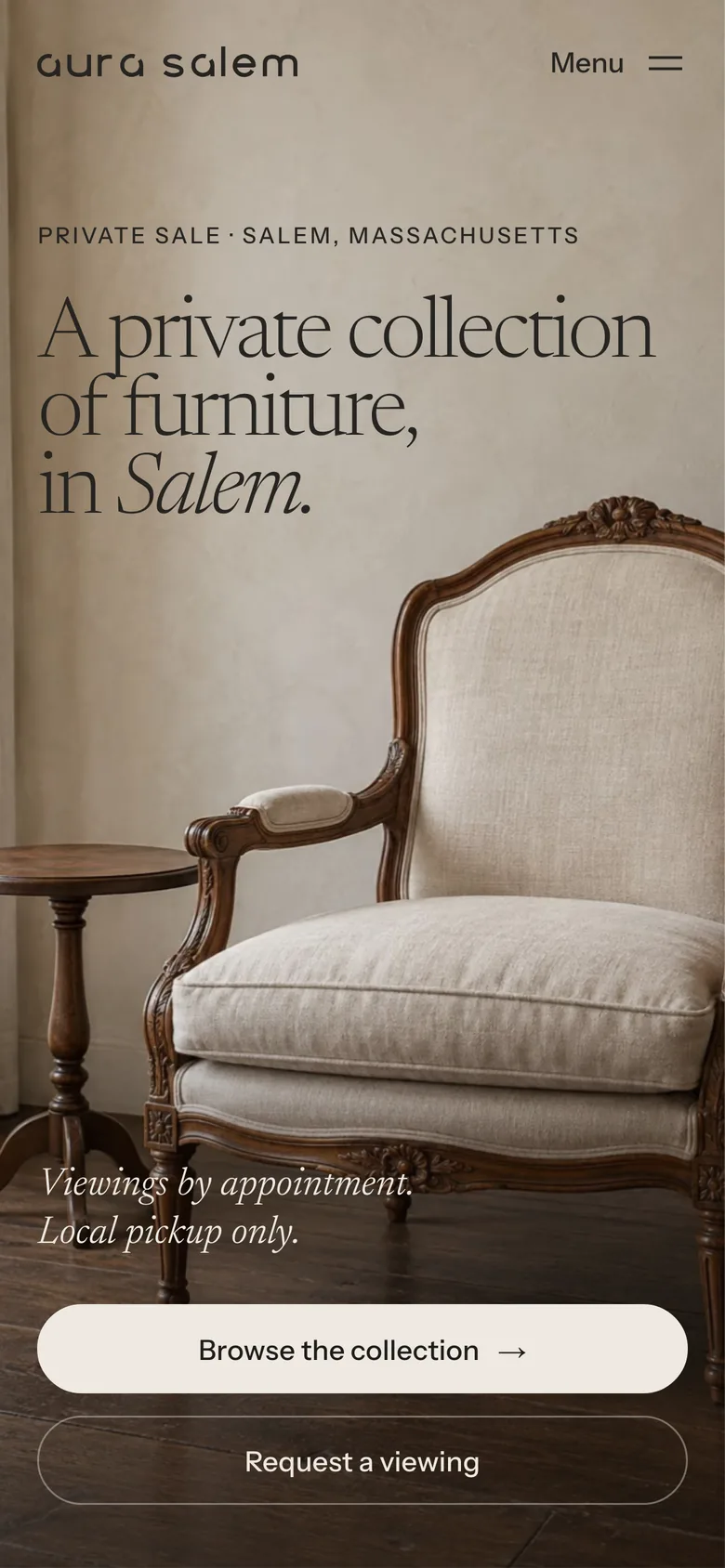
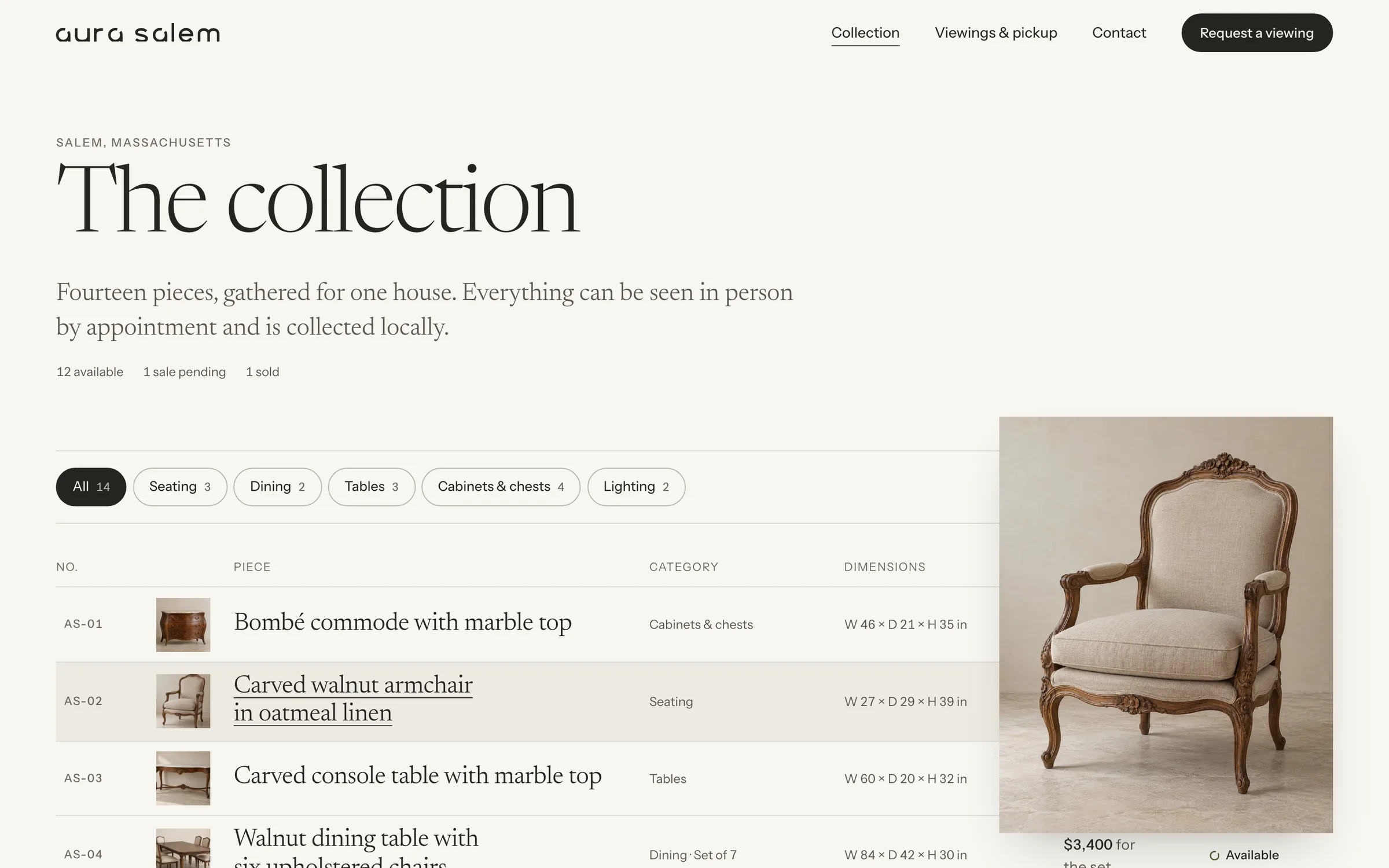
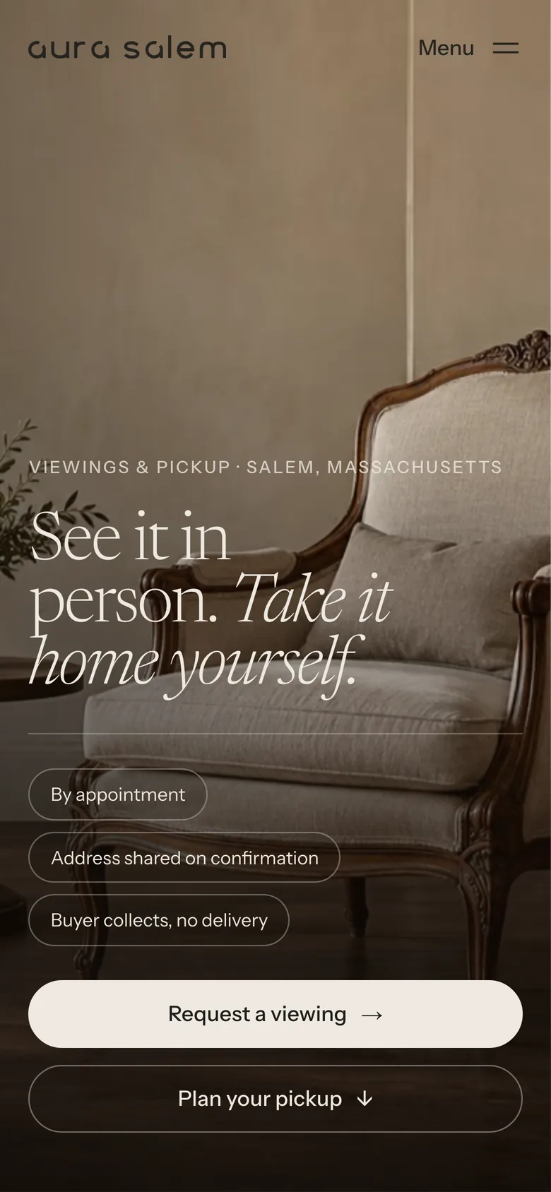
On the homepage, the collection opens as a double-page spread: a full-bleed plate on the left, a numbered index on the right. The plate changes with the piece you are reading, without hijacking the scroll. On a phone, it becomes a rail you swipe with your thumb.
- Pieces numbered AS-01 to AS-14, like lots in a sale
- Price, size and status on every card: nothing “on request”
- Gallery or index view, and category filters that work without JavaScript
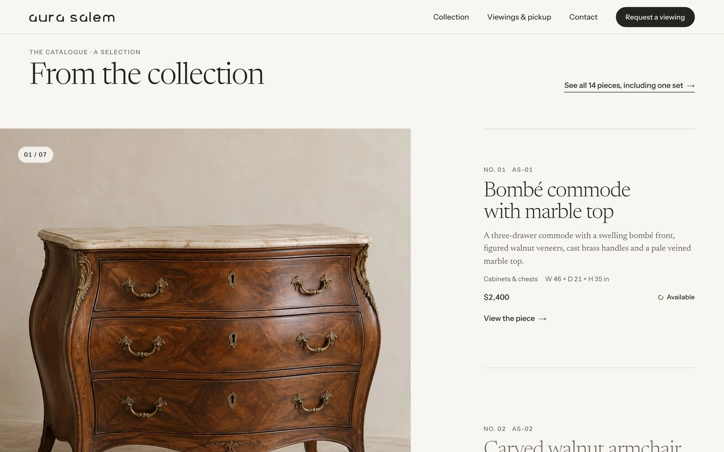
- 1Which spread you are on, like a page number
- 2A lot number and a plain name
- 3The price, in plain sight
- 4Status ring, drawn from the logo
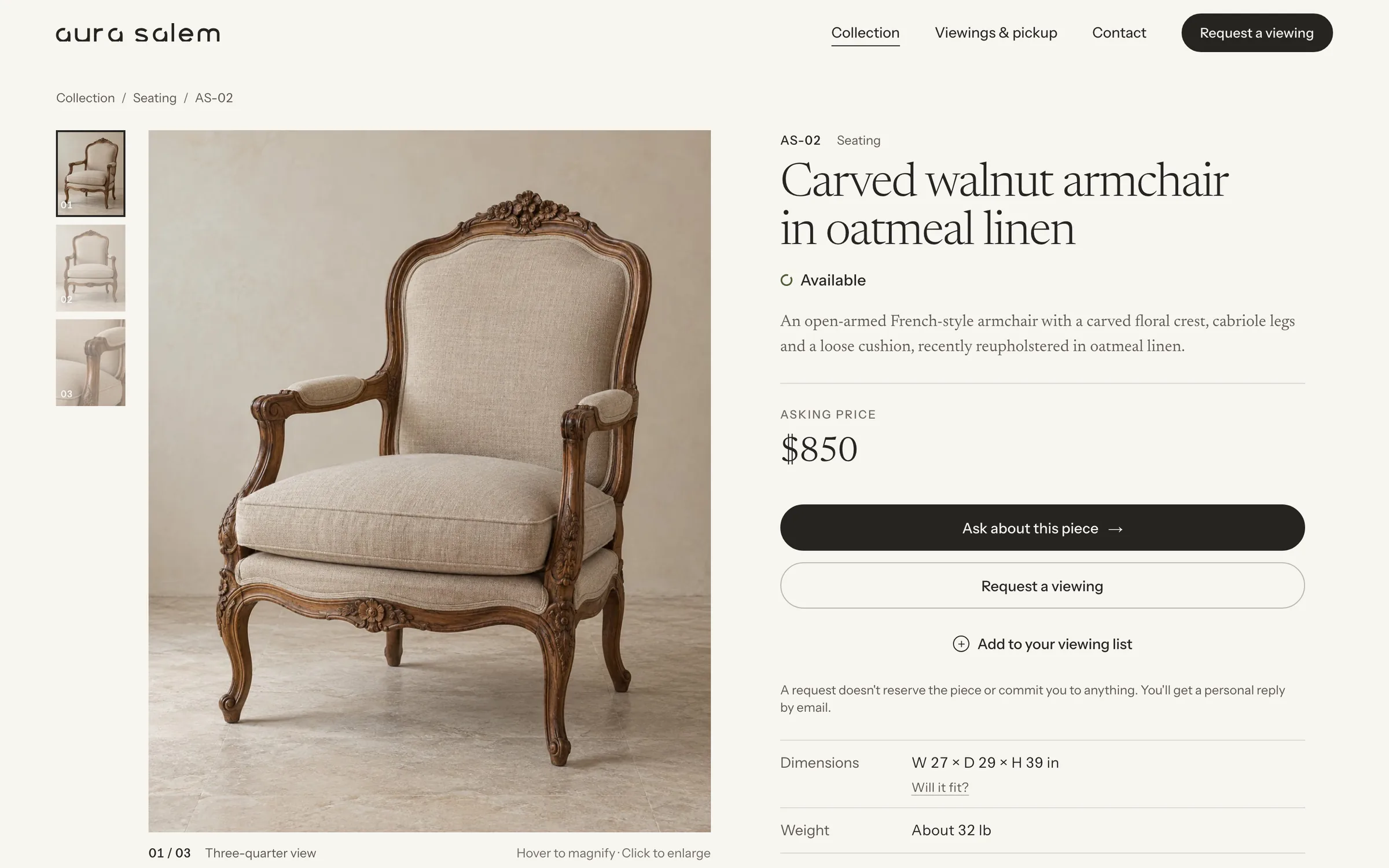
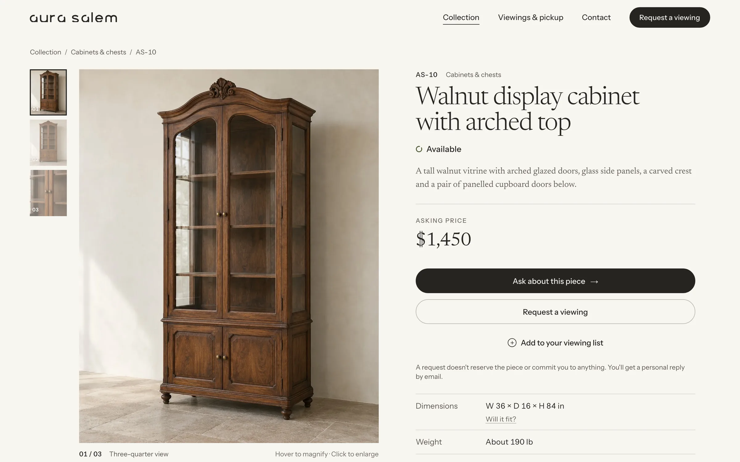
A product page that reads like a condition report
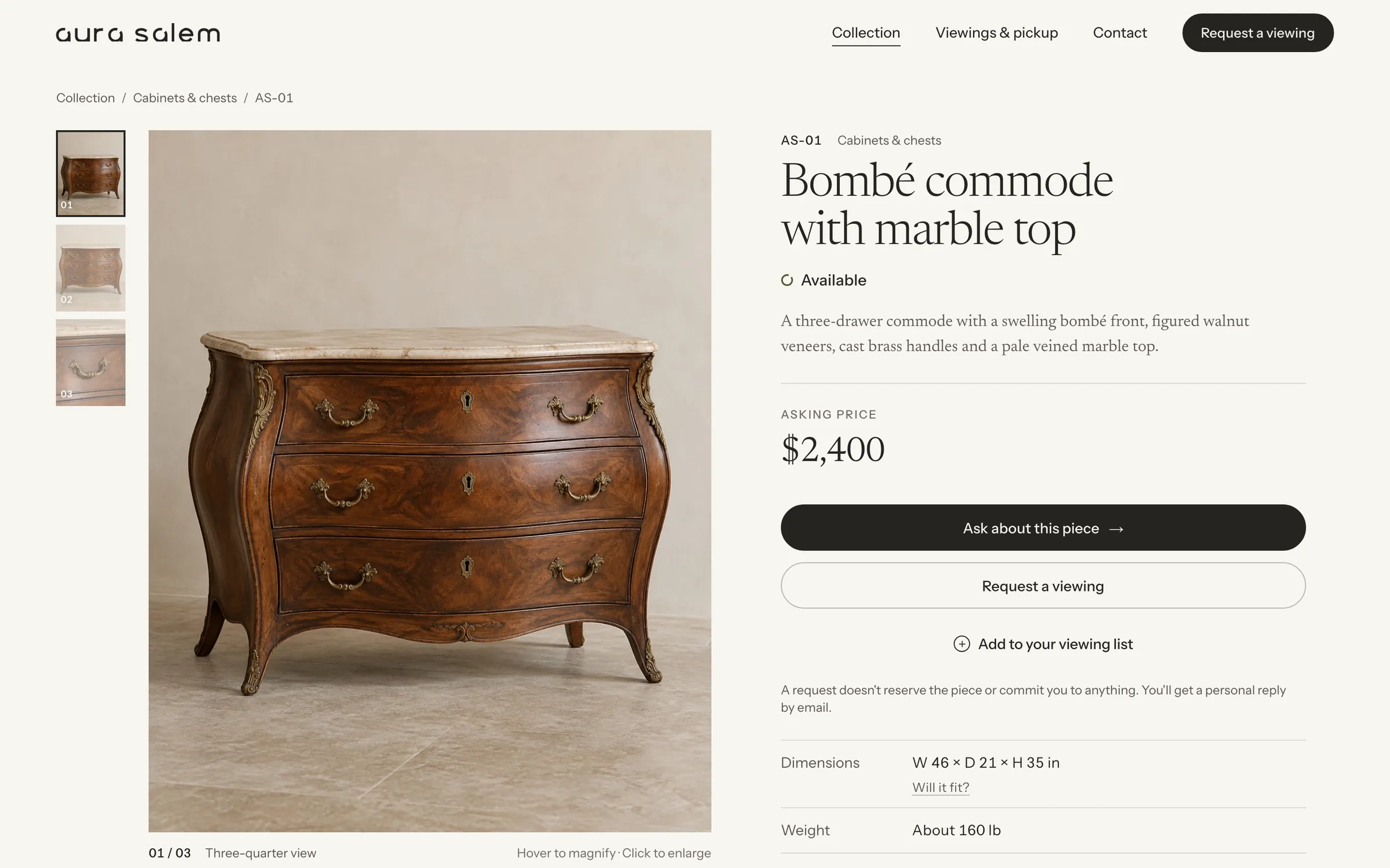
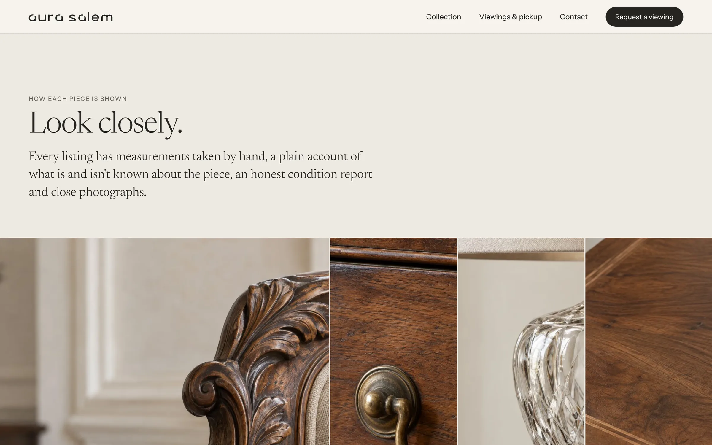
The price is visible. Hiding it filters nobody out; it only postpones the moment until everyone has lost an afternoon. Next to it: what a request does and doesn’t do (it reserves nothing and commits you to nothing), measurements in two systems, an honest condition grade and pickup notes.
A ×2 loupe follows the cursor over carving, grain and hardware, and the full-resolution image only downloads when you open it.
The work nobody sees
The old page weighed 23 MB and took two minutes to show its main image on a phone. The new one weighs under 1 MB, with 11 KB of JavaScript for the whole site. There are no trackers and no analytics, phone photos lose their GPS coordinates on the way in, and her address is only sent once a viewing is confirmed. It all runs on free tiers: the only bill is the domain.
- A new piece is a folder: one text file and its photos. No admin panel, no subscription.
- One command prepares phone photos: converts, straightens, strips the location
- Deploys refuse to go live with sample listings or in preview mode
- 29 automated tests on the inquiry endpoint; mail signed with DKIM, SPF and DMARC
I wanted to sell the furniture without opening a shop, and without it looking like a flea market. Ernest understood right away. I wanted every piece to be seen the way it deserves, and anyone who wrote to already know whether it would fit and how to take it home. The website is beautiful, and the best part is that inquiries arrive complete.
The system behind the screens
The furniture is ornate, so the interface stays quiet and never competes with it. One idea runs through everything: the open “a” of the logo, a halo with a gap in it, becomes the system that tells you whether a piece is still available.
Color
Three status colors and nothing else. Every hue in the interface has a job; the warmth comes from the walnut, marble and brass in the photographs.
Typography
A private collection of furniture, in Salem.
Headlines · reading textA serif with optical sizes: delicate at 168 px, sturdy at 19 px. Italic is the second voice.
W 46 × D 21 × H 35 in · About 160 lb
Data · controls · labelsA plain sans for everything you measure, compare or press.
Grid & spacing
- Columns
- 12
- Max width
- 1680px
- Gutter
- 32px
- Base unit
- 8px
Twelve columns up to 1,680 px, with fluid margins and type. Headlines reach 168 px against 12 px labels: scale does the hierarchy, so color doesn’t have to.
Decisions, and why
-
01
The price is always visible
WhyIt tells people whether the trip is worth it, and filters out inquiries that wouldn’t go anywhere.
Instead of
“Call for price”, which turns every question into a phone call. -
02
Three items in the menu
WhyCollection, Viewings & pickup, Contact: the three things people actually come for.
Instead of
Nine tabs, a blog and a shop for a sale that has neither. -
03
Motion never hides content
WhyBeauty makes a site feel easier to use, but it doesn’t excuse obstacles (NN/g, the aesthetic-usability effect).
Instead of
Scroll-jacking, a popup and an auto-playing carousel. -
04
No false urgency
WhyNo countdowns, no “only 1 left”, no struck-through prices (Mathur et al., 2019). Every piece here is one of a kind anyway.
Instead of
Urgency banners borrowed from fast fashion. -
05
One light for fourteen pieces
WhyThe owner’s photos were relit and set against one wall with AI, without touching the pieces themselves, so the collection reads as a set.
Instead of
Fourteen rooms, fourteen lights, fourteen color casts.
Schema
- The logo’s open “a”
- Available · open ring
- Sale pending · ring with a dot
- Sold · closed disc
- Sending indicator
- “Message sent” mark
- Steps of a viewing
- End of the line between sections
- Logo & identity guide
- Art direction & photography
- Content strategy & UX writing
- Catalogue: spread, gallery & index
- 14 product sheets with “What is known”
- “Will it fit?” checker
- Viewing list & pickup planner
- Inquiry form, anti-spam & email delivery
- Maintenance scripts for a non-technical owner
- Open the catalogue to search engines, one indexed page per piece.
- Generate one ad per piece from its own photos and data, linked to its sheet.
- A one-page price list for decorators, built from the same source.